dataAgro, a Commercial Management Platform for Grain Trading
End-to-end UX/UI redesign of a legacy commercial management platform for one of Argentina's largest agribusiness companies, simplifying dense operational workflows without rebuilding the system from scratch.
A complex internal tool for one of Argentina's largest agribusiness companies
Molinos Río de la Plata needed an internal platform for their commercial grain trading team, covering supplier contacts, purchase contracts, price fixes, and activity reporting across four user roles. I was the sole designer, embedded directly with the PM, system architect, and development team, and also responsible for the responsive HTML/CSS.
The constraint: redesign without starting over
There was no time or budget to rebuild from scratch. The navigation, header, and underlying structure had to stay. The tables were rendered inside iframes, which meant the layout inherited a fixed width that made every data-heavy screen feel cramped.
The most visible problem: sidebar filters were eating into the already limited table width, leaving traders squinting at truncated columns. The fix was straightforward, move filters to the top, let the table use the full width.
Previous system — sidebar filters competing with the table for horizontal space. With tables inside iframes, there was little room to spare.
One interface, four roles
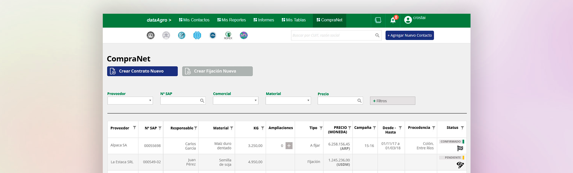
CompraNet connected Molinos buyers with grain suppliers through a shared contract and price-fix management system. Four roles — Visualizer, Table, Analyst, and Manager — each needed a different level of access without a different interface. A Visualizer sees read-only data and a single Close button. A Manager can edit confirmed contracts, adjust quantities, and trigger finalization. The UI carries the permission logic, not a training manual.
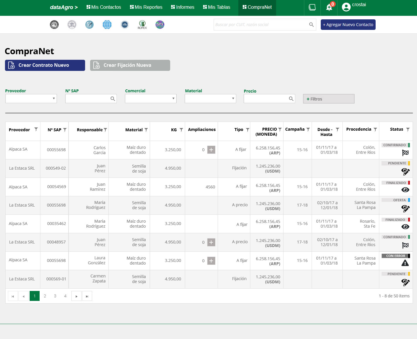
The contract table — the operational heart of CompraNet. Multi-column filtering, color-coded status badges across 5 states (Confirmed, Pending, Finalized, Offer, Error), and role-sensitive inline actions. Designed to handle 50+ records without losing scannability.
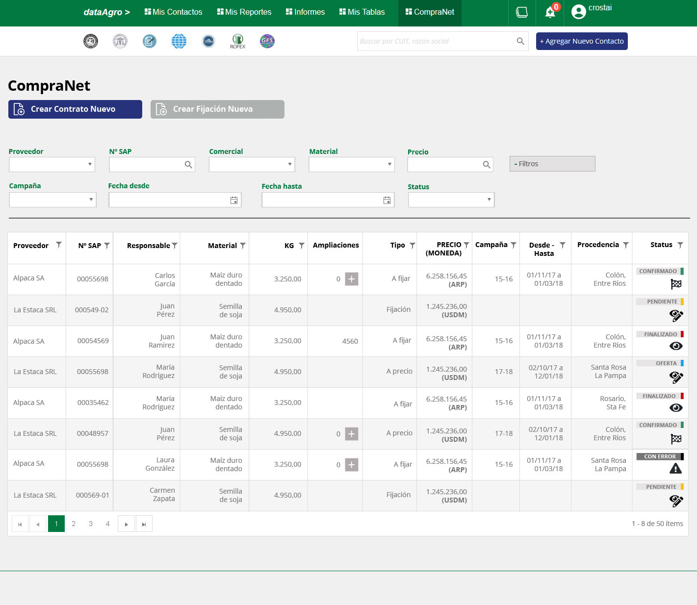
Progressive filter disclosure — the default view stays clean with 5 primary filters; advanced options (campaign, date range, status) appear on demand. A pattern that worked equally well on desktop and mobile.
Same modal, different control
The visual language is consistent across roles. What changes is what's editable, which actions appear, and how much data is exposed.
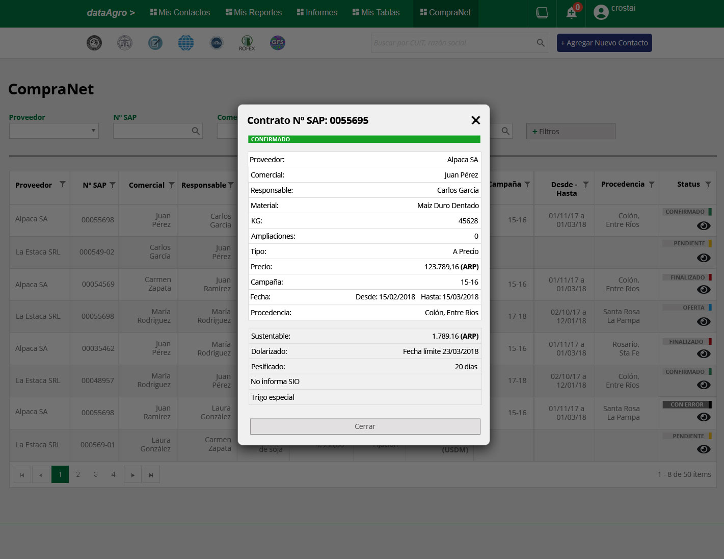
Visualizer — read-only. All data visible, no actions except Close.
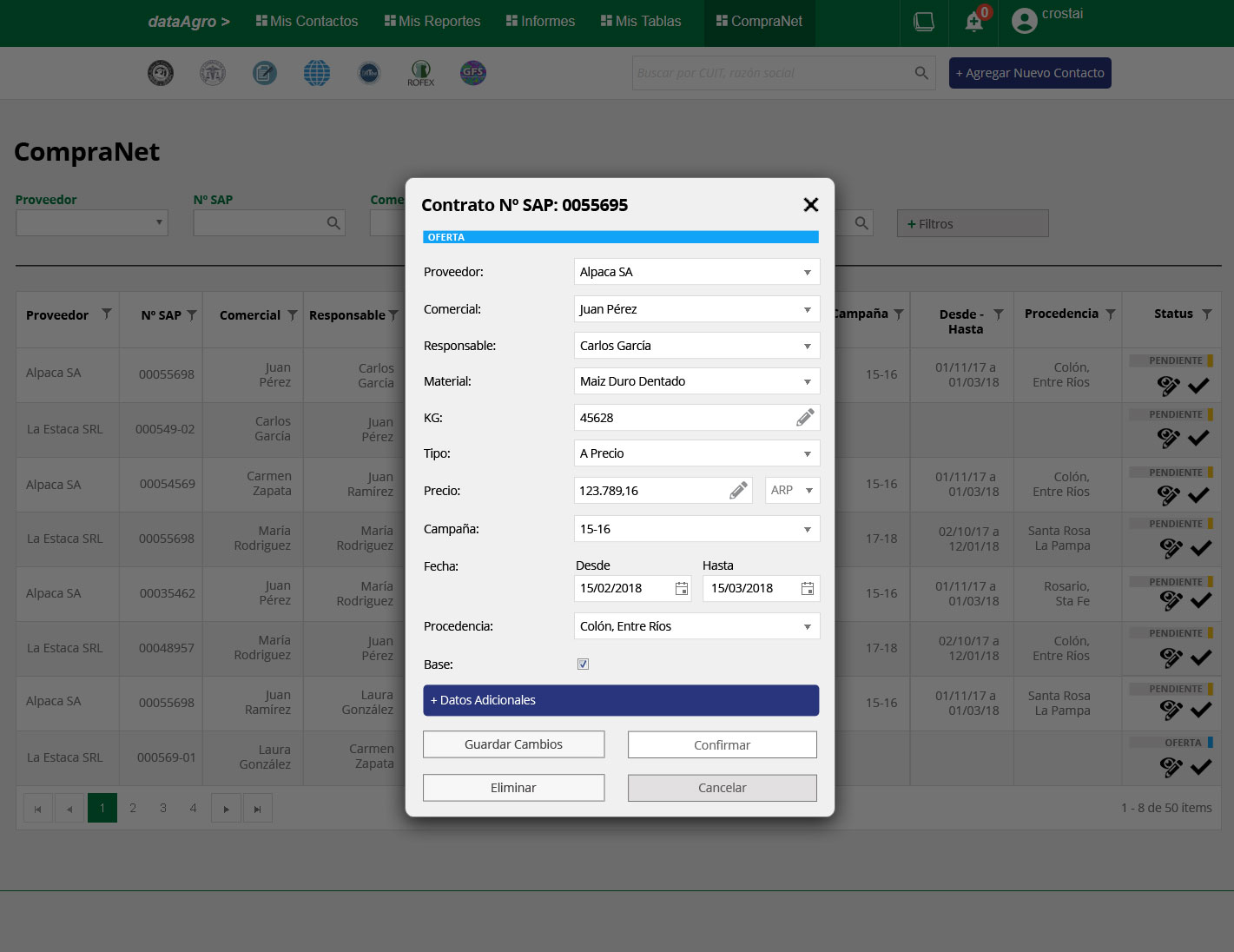
Table — can edit Offer and Pending contracts, confirm receipt. Cannot create or finalize.
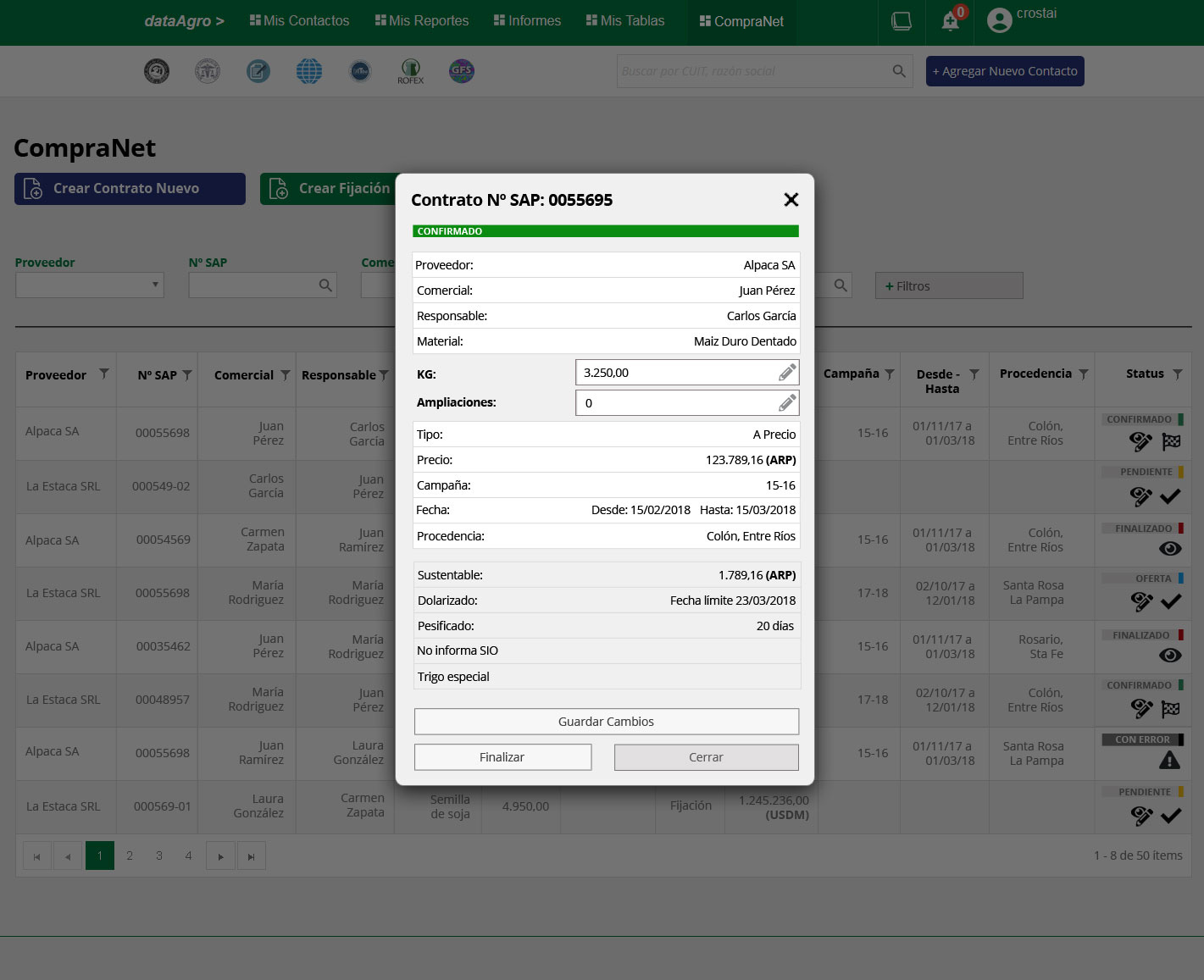
Manager — can edit KG and extensions on confirmed contracts, and trigger finalization.
Five states, readable at a glance
Contracts move through Offer → Pending → Confirmed → Finalized, with Error as a recoverable exception. Color and label make the state legible directly in the table row — no need to open the record to know where things stand.
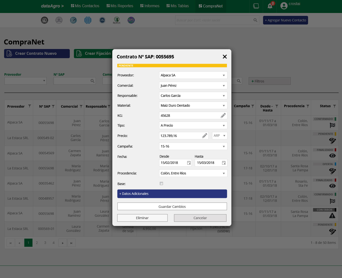
Pending — editable form. The status bar at the top anchors the current state before the user reads a single field.
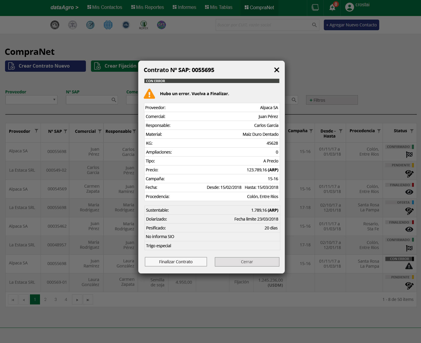
Error — a recoverable state with a clear warning and a single recovery action. The user is never left without a path forward.
Full-page creation, inline editing
Creating a contract is a focused, one-time task — it gets a dedicated page. Editing happens in the flow of reviewing many records, so it lives in a modal that keeps the table visible underneath. The creation form also uses progressive disclosure: additional contract attributes (sustainable grain, dollarized pricing, peso-fixed terms) are hidden by default and expand only when needed.
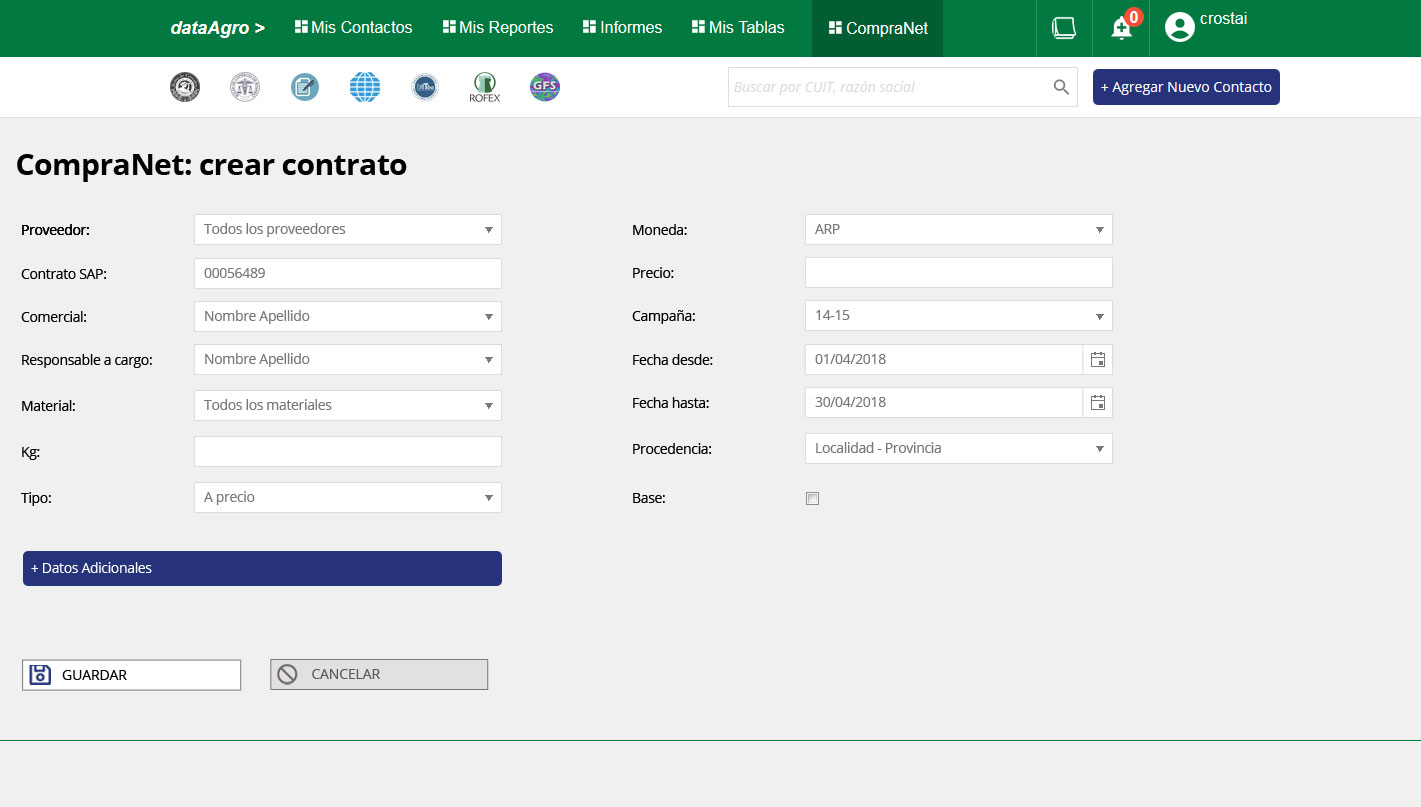
Contract creation — full page, two-column layout. Related fields grouped side by side to reduce scrolling without sacrificing clarity.
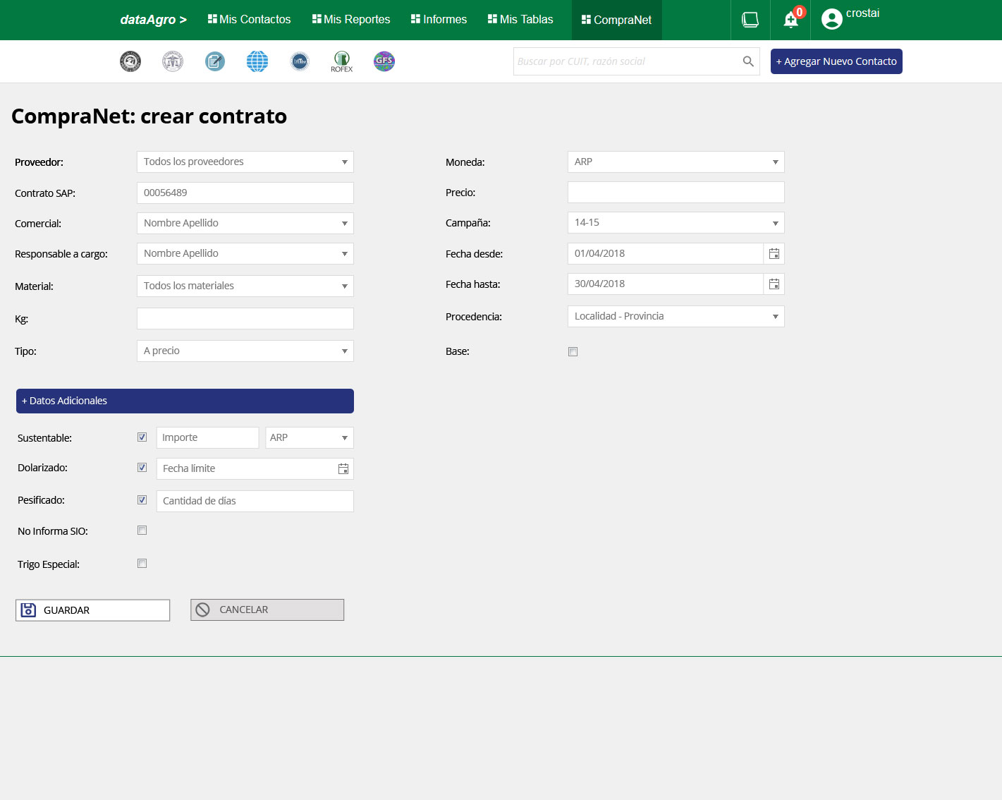
Additional Data expanded — conditional fields appear only when the corresponding option is checked, preventing empty fields from cluttering the form.

Responsive mobile view — the platform's hardest design problem. A 12-column data table rebuilt for mobile without losing editability or critical information. Solved entirely in HTML/CSS, no separate mobile build.
Shipped. Used in the field. Led to a second project.
The platform covered the full commercial workflow — contacts, contracts, price fixes, reporting — responsive across all devices, serving four roles through a single adaptive interface. User feedback was positive, the team adopted it without formal training, and the engagement led directly to a second project with Molinos.