Printed Guides → Offline Mobile Platform for 20,000 Employees
Transforming 72 printed operational guides into an offline-first mobile experience used daily across a global organization, sole designer, end-to-end ownership, delivered in 8 months.
Transforming printed operational guides into a mobile experience
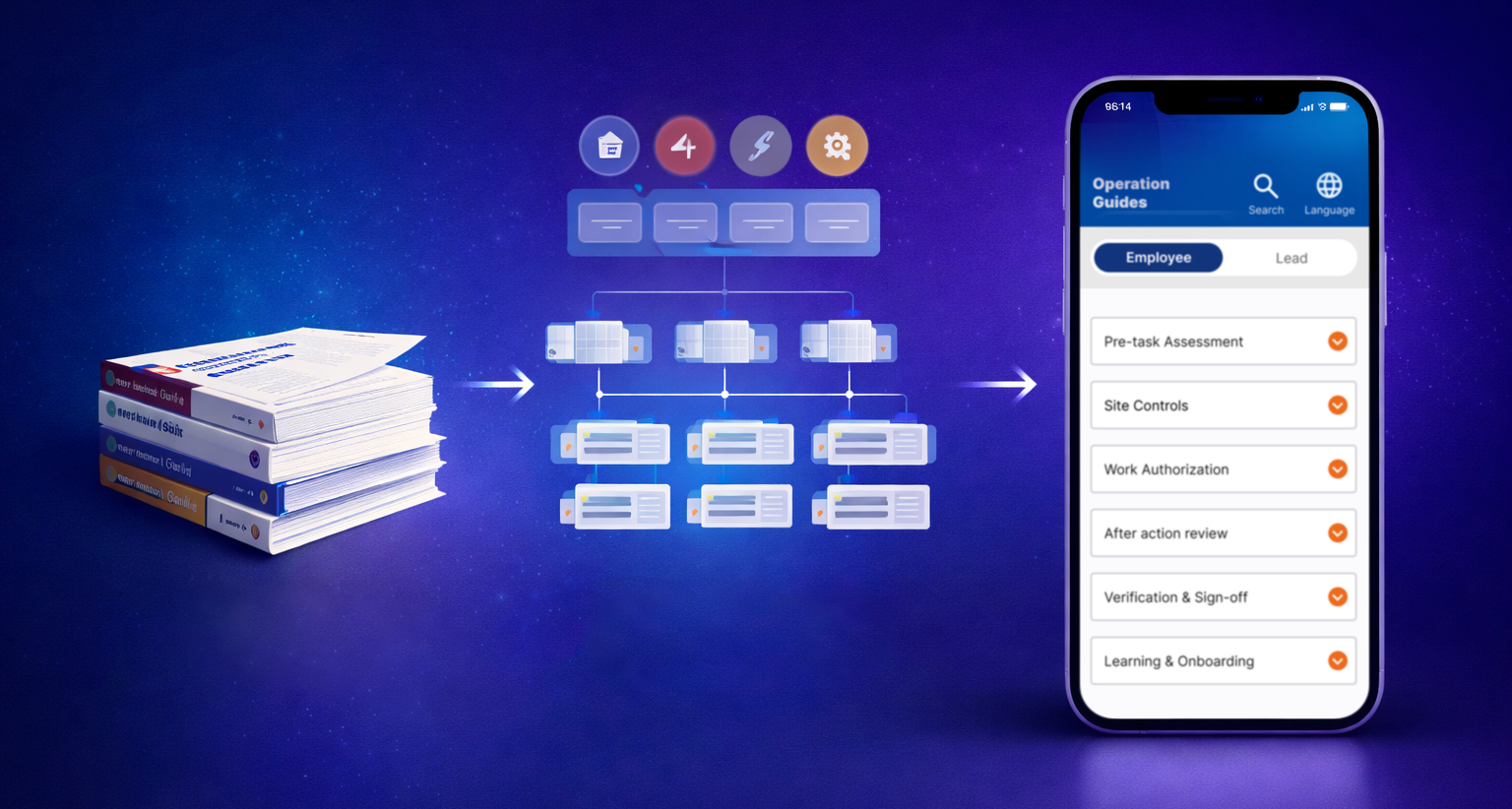
A large global organization relied on 72 printed operational guides containing technical procedures used daily by operational workers and leads in demanding environments. The guides were difficult to navigate, expensive to maintain, and impractical to carry and use on-site.
The objective was to transform this documentation into an offline-first mobile application. Analyzing the 72 guides revealed a consistent 14-section structure across all operational areas, which became the foundation of the app's information architecture (a deliberate choice to preserve familiarity and minimize the learning curve for users with limited digital experience).
Sole Product Designer responsible for end-to-end product design. I collaborated with the Product Owner, Project Manager, engineering team, system architect, and operational stakeholders, aligning these groups around an MVP scope that was technically feasible while still meeting user needs. This required negotiating trade-offs, advocating for user needs against technical and time constraints, and defining what would ship in the first release versus later iterations.
I collaborated with a researcher on usability testing. I built the low-fidelity prototype used in the sessions and participated in the testing directly, translating findings into design decisions. Three of those findings changed the design directly and are documented in the Key Design Decisions section below.
Mapping the 72 operational guides revealed a consistent 14-section structure across all areas. This became the IA backbone and primary navigation model, preserving the mental model users already had from the printed version.
Biweekly sessions with the PM, engineers, and operational leads shaped MVP priorities and surfaced technical constraints early, allowing design decisions to account for system limitations before they became blockers.
Collaborated with a researcher to test low-fidelity prototypes with real operational employees. I built the prototype and participated in the sessions. Testing validated the navigation model and surfaced three findings that changed the final design directly.
Navigation mirroring the structure of the printed guides
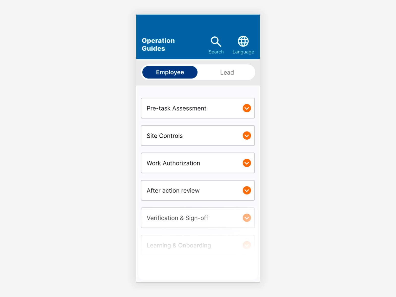
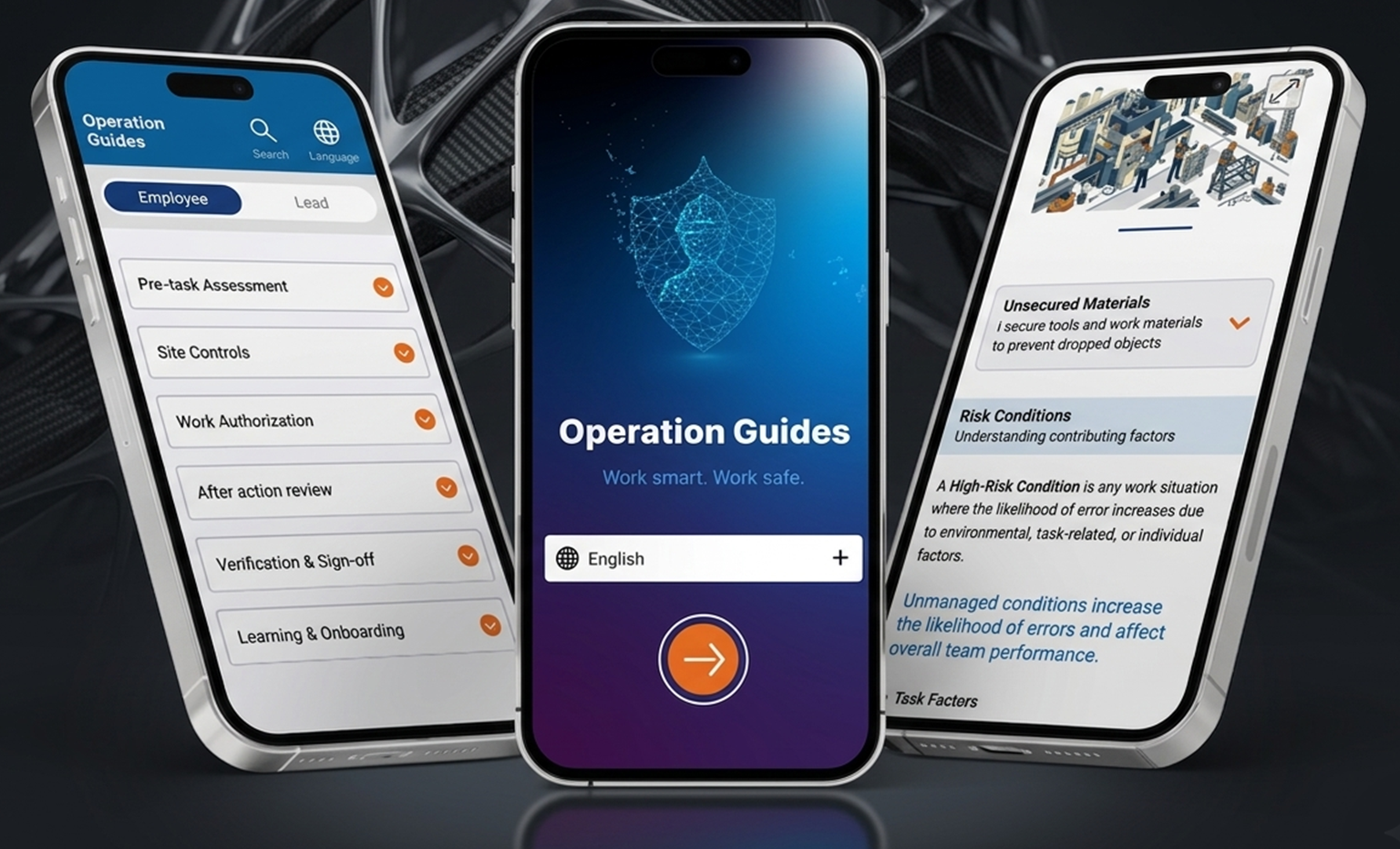
Employee view, 14 sections mirroring the printed guide structure. Accordion navigation allows scanning the full content map without scrolling through procedures.
Same structure, adapted for higher content volume
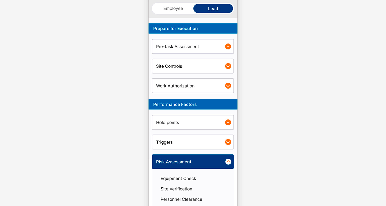
Lead view, same 14-section structure with section titles grouping accordions where content volume required additional visual anchors. Added after usability testing with Lead users.
A content system designed for density and quick scanning
Each guide supports multiple content formats within the same screen: introductory text, highlighted callouts, bullet lists, illustrated references, and expandable detail sections. Progressive disclosure keeps the overview visible while allowing users to expand only what's relevant to their current task.
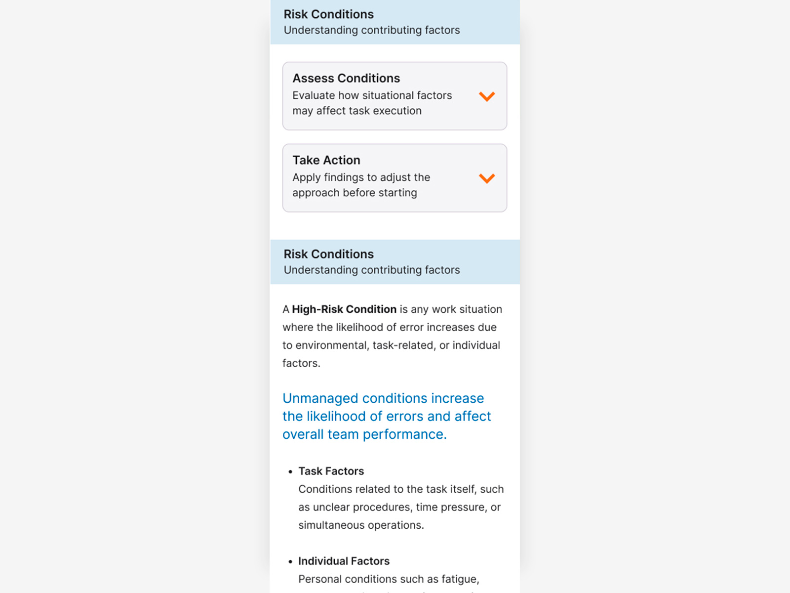
Guide overview, all sections collapsed, giving users a full map of the procedure before expanding any detail.
Guide detail, one section expanded showing the full content system: introductory text, highlighted callout, bullet list with subcategories, and illustrated reference. Other sections remain collapsed.
Language selection on first screen. Search designed for post-MVP.
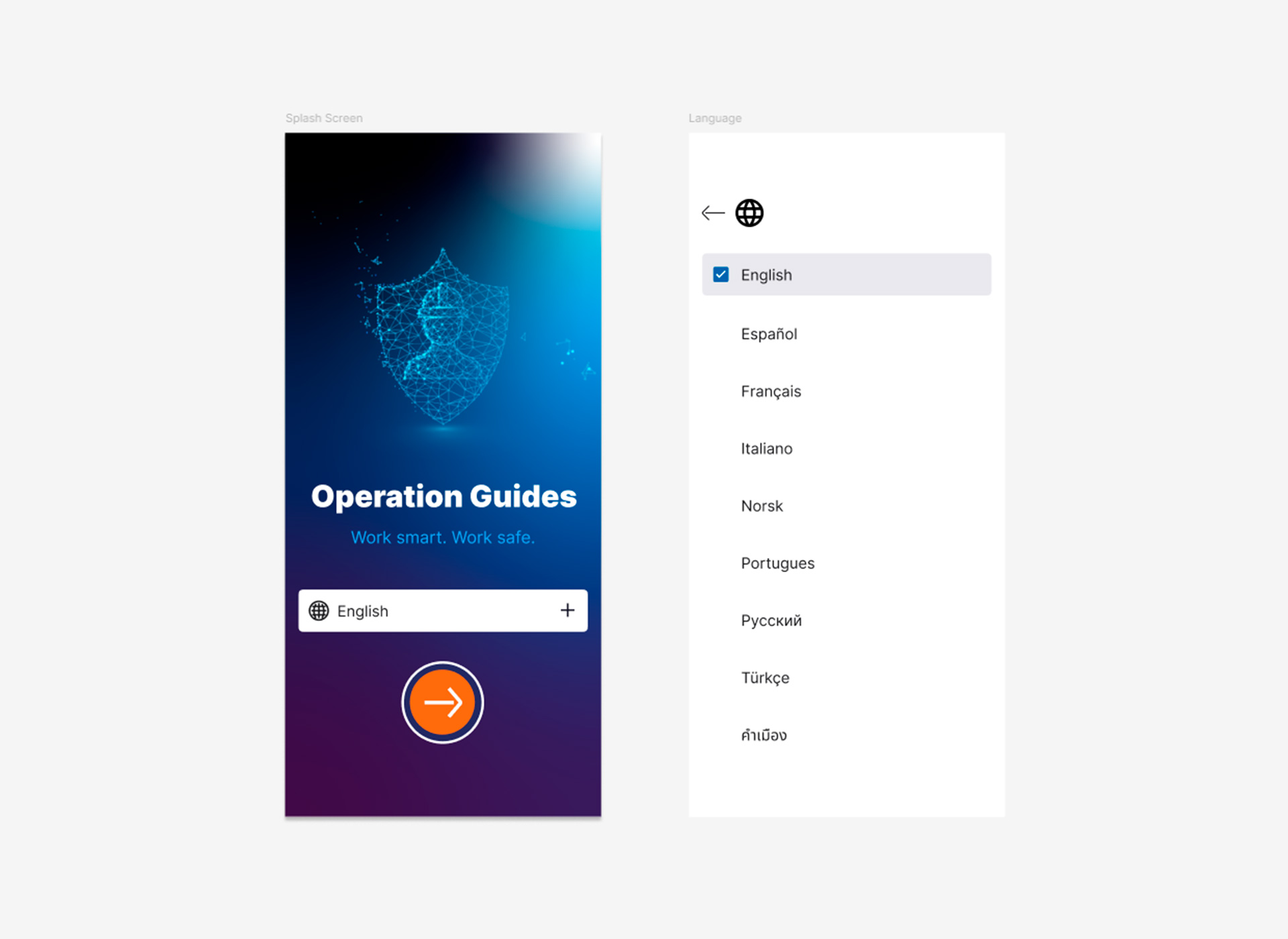
Language selection on the splash screen, placed before any content is loaded so users can access the app in their language from the first interaction, preventing friction on devices configured in a different language by default.
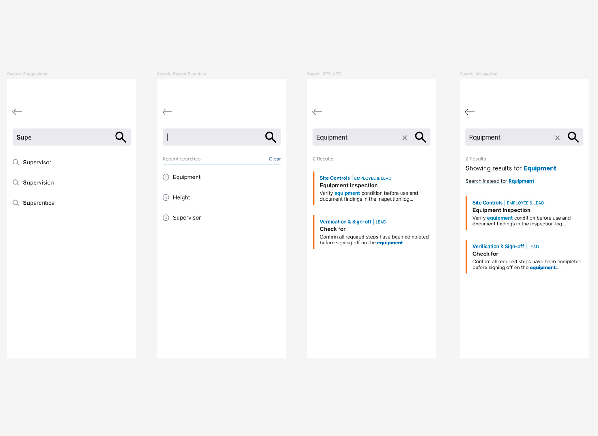
Search, designed in parallel with the MVP and planned for the following release. Includes empty state, suggestions, recent searches, results with source section labels, and misspelling correction.
Choices that shaped the product
72 guides, dense content. Accordions let users scan the full structure first and expand only what's needed. Validated in testing: faster procedure lookup than navigating through screen levels.
This also informed three specific interaction decisions:
- Close button at the bottom of each expanded accordion, so users don't need to scroll back up to collapse it.
- Back link at top and bottom of each guide, returning to the previously open section and preserving navigation state.
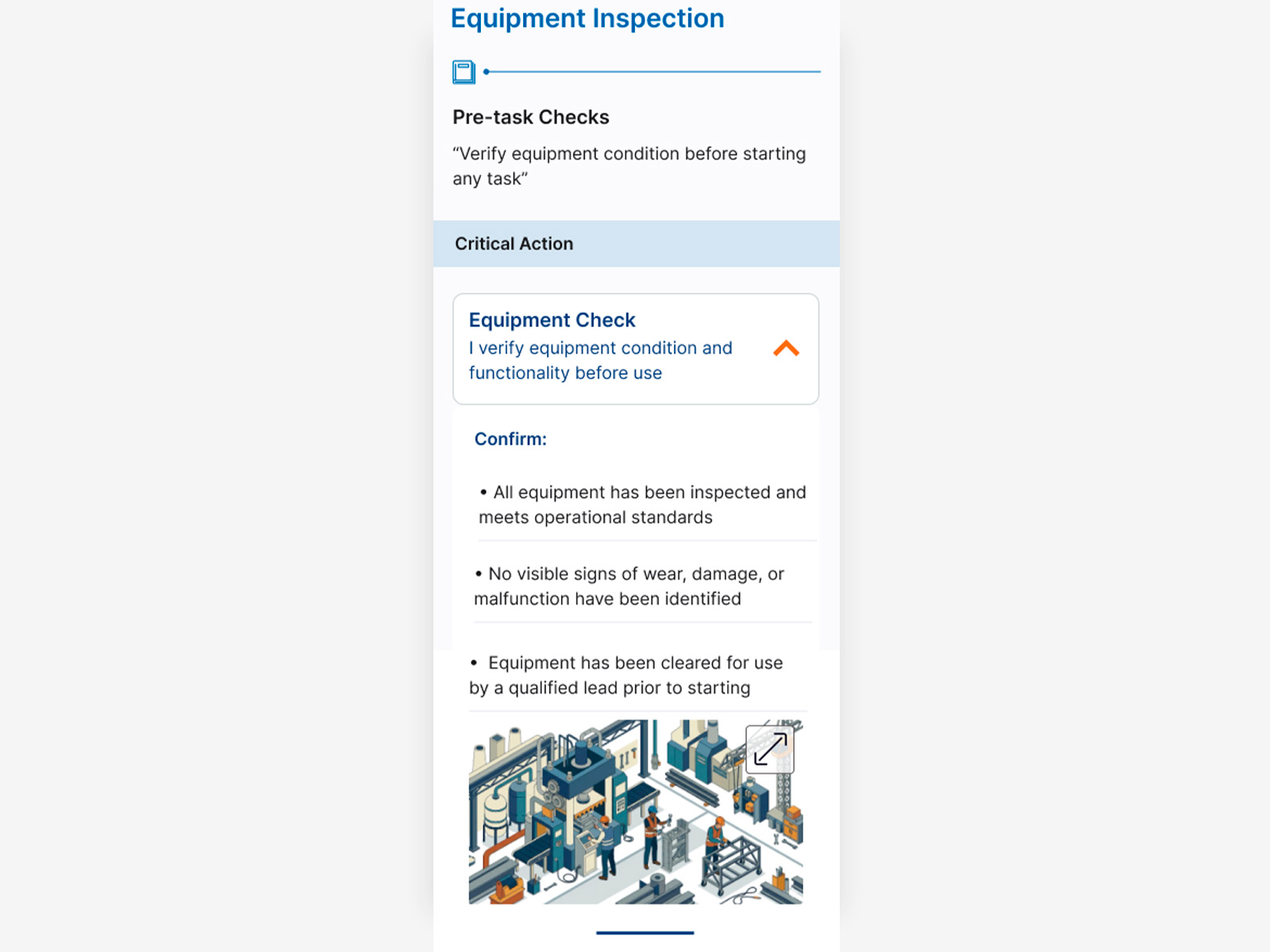
- Images expandable to full screen for detail inspection in operational conditions.
Built on the structure users already knew from the printed guides, minimizing learning curve. Also operationally flexible: guides can be added or removed without structural changes to the app.
Navigation icons are always paired with text labels for the same reason: users with limited mobile experience can't rely on icon recognition alone.
Without it the app would have been inaccessible to a significant portion of users from day one. Not a post-launch enhancement, a core requirement I pushed for from the start.
System limitations ruled out search in the first release. The 14-section navigation was designed specifically to allow procedure lookup without it. Full search designed in parallel for the following release.
- Early wireframes used a bottom tab bar. Operational workers found the top placement more intuitive.
- The Lead view gained section titles as a grouping layer after testing revealed the volume of procedures was hard to scan.
- A Learning & Onboarding section was added after testing surfaced users who needed orientation before accessing procedures.
Images optimized for offline reliability, included only where they add comprehension value text alone can't provide.
Shadows and elevation effects were avoided for the same reason: in outdoor conditions with direct sunlight, they become invisible and add visual noise without functional value.
Annotated screens — decisions and accessibility
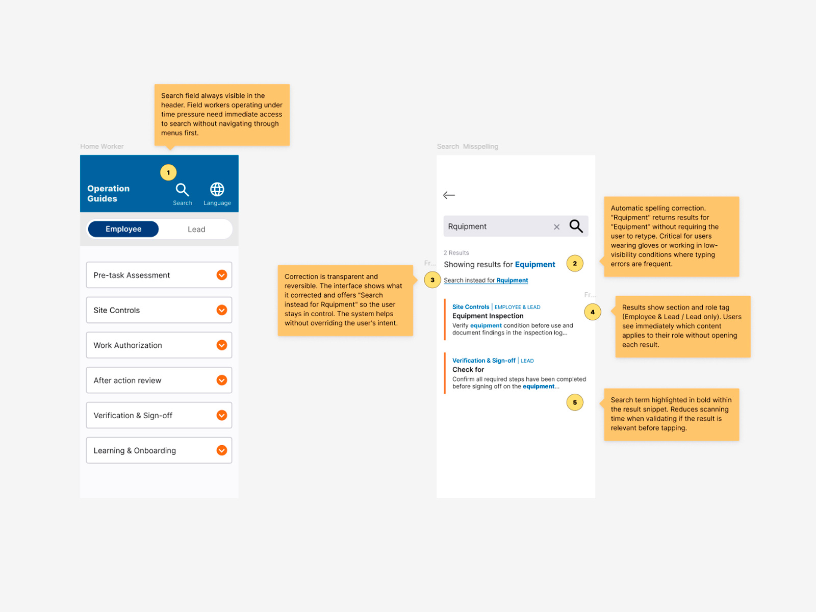
Design decisions — search and navigation annotated. Two screens annotated with UX decision rationale. Search field anchored in the header because field workers under time pressure need immediate access without navigating first. Spelling correction surfaces results for "Equipment" when the user types "Rquipment," critical for workers using gloves or operating in low-visibility conditions. Correction is transparent and reversible: the system helps without overriding user intent. Results display section and role tag so workers see immediately which content applies to their role without opening each result.
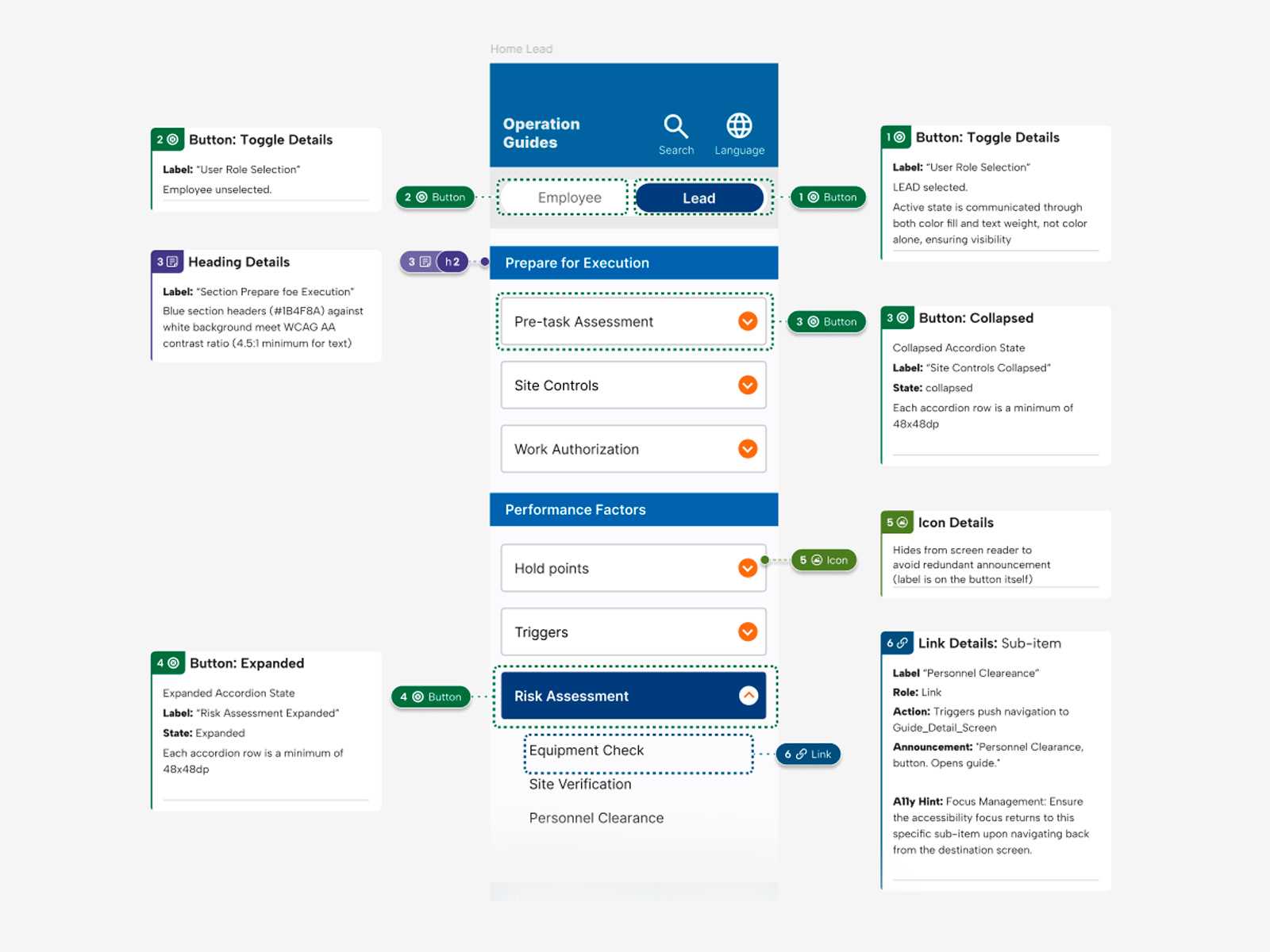
Accessibility annotations — ARIA roles, states, and contrast. Accessibility documentation for the Home Lead screen. Toggle active state communicated through both color fill and text weight, not color alone. Section headers meet WCAG AA contrast ratio (4.5:1). Accordion states documented with ARIA labels for collapsed and expanded, each row sized at minimum 48x48dp for touch targets. Decorative chevron icon hidden from screen reader to avoid redundant announcement. Sub-item links annotated with role, action, announcement text, and focus management behavior for navigation back from detail screens.
Delivered on time. Used every day.
The application was delivered in eight months by a single designer and deployed to approximately 20,000 employees, becoming the standard operational reference tool across the organization.
Usability testing showed an estimated 15% reduction in time to locate procedures, based on user-reported feedback during first-time interactions with the digital format, a meaningful gain in environments where speed and accuracy directly affect operational outcomes. Replacing the printed manuals also eliminated a significant ongoing cost for the organization.