Dios Salve a la Reina: Visual Direction for a Global Queen Tribute Show
Fifteen years shaping a flexible visual direction system for one of the world’s leading Queen tribute productions, creating scalable campaign identities across tours, formats, markets, and physical environments.
A global show with evolving identities
Dios Salve a la Reina is an internationally touring Queen tribute band, performing across Europe, the United States, Asia, and Latin America.
Each tour required its own identity while remaining unmistakably recognizable as part of the same brand. The challenge was designing a system flexible enough to evolve with each performance concept, yet consistent enough to sustain recognition across continents, formats, and audiences.
Photo retouching and compositing were done entirely by hand, years before AI tools existed. The identity was designed as a flexible system rather than a fixed visual, evolving across shows, formats, and audiences.
Designed to scale, from large-format campaigns to low-budget executions without losing identity.
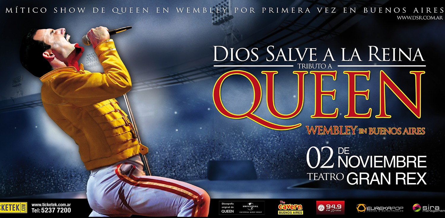
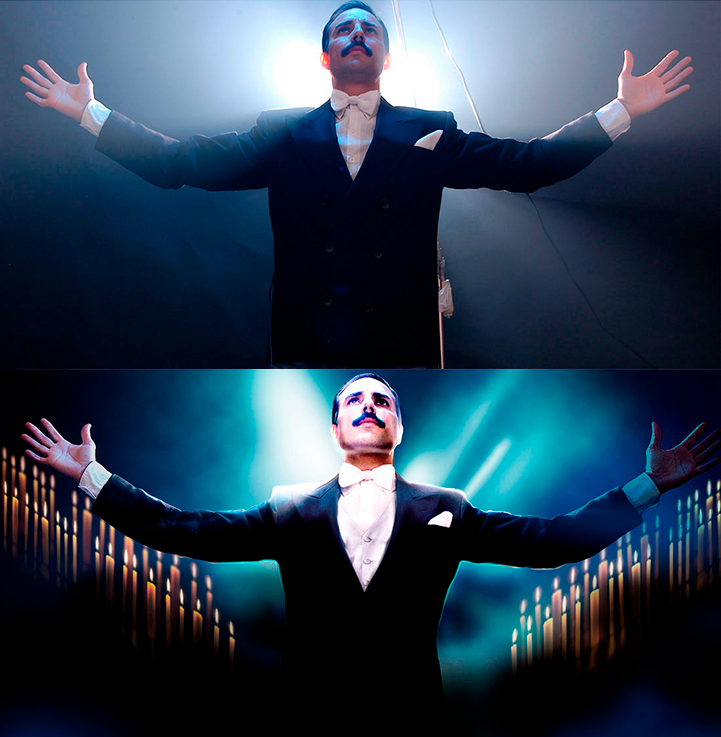
Wembley-era visual reference
Collage approach
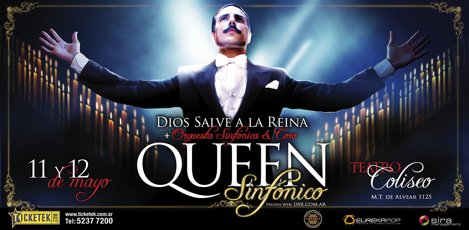
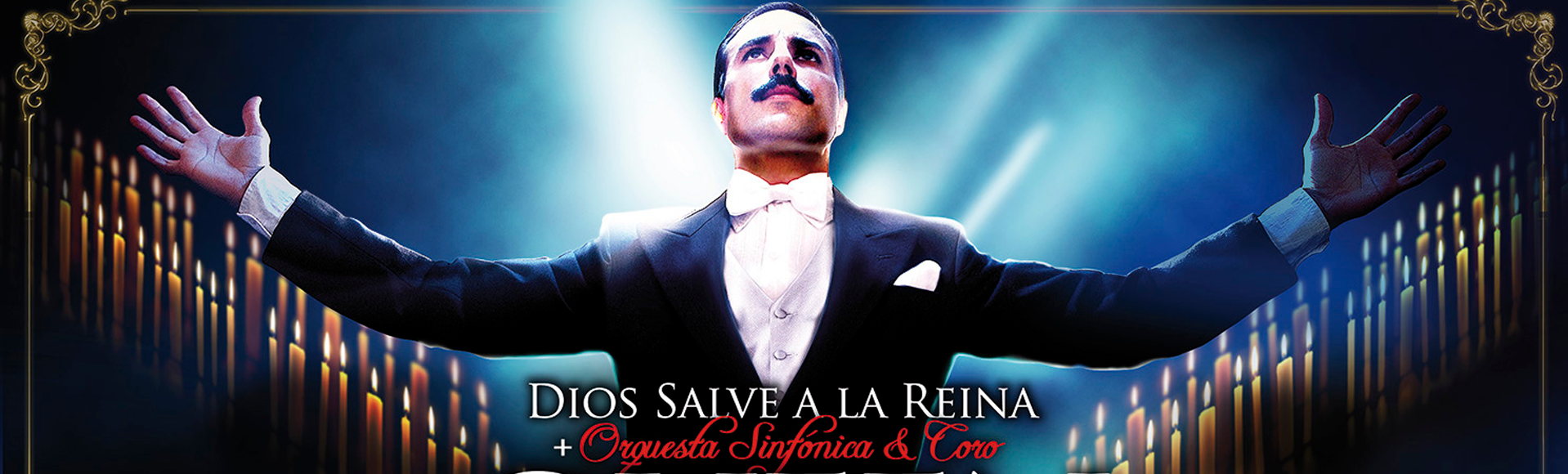
Symphonic show
One band, multiple visual narratives
Rather than enforcing a fixed identity, the work established a creative framework where each show could adopt its own narrative, palette, and visual rhythm while preserving a coherent brand signature across touchpoints.
This approach allowed composition, texture, and typography to shift with the tone of each performance, from theatrical and symphonic to stadium-scale spectacle.
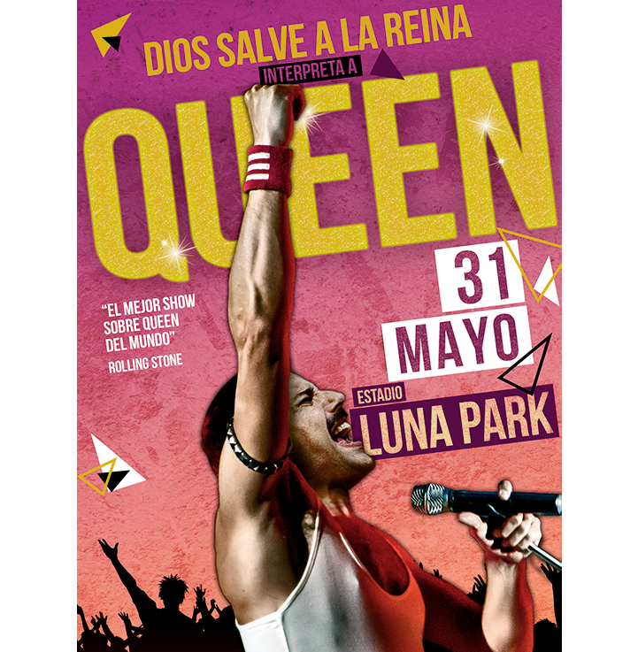
Campaign poster — designed for street-level impact at large scale.
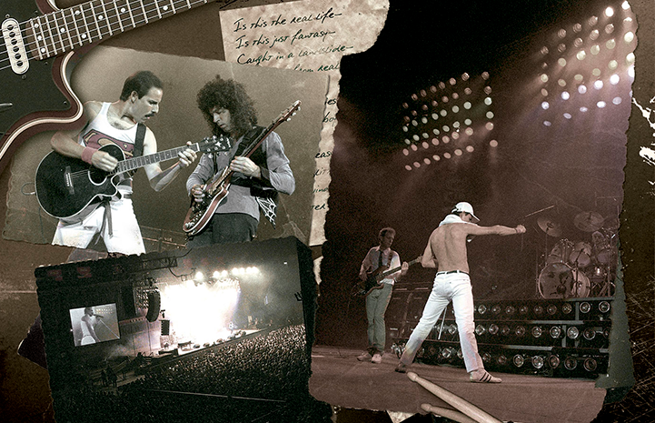
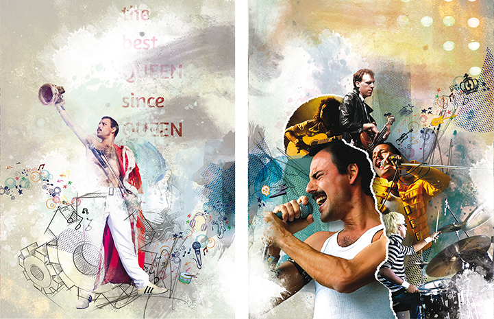
Photography as composition
Photography became a modular design asset, not documentation. Images were treated as compositional material: layered, fragmented, recolored, and recomposed into campaign systems that could scale from intimate print pieces to city-scale executions.
Textures, analog references, and graphic overlays reinforced the ideas of memory, archive, and spectacle, translating the energy of live performance into a distinct visual language.
Layered photography and lighting treatment to recreate the theatrical essence of Queen’s live performances.
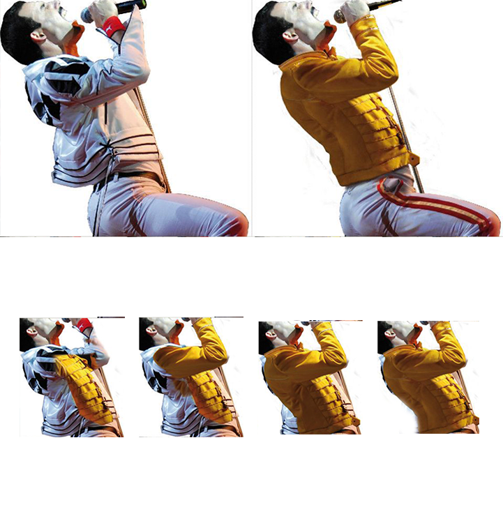
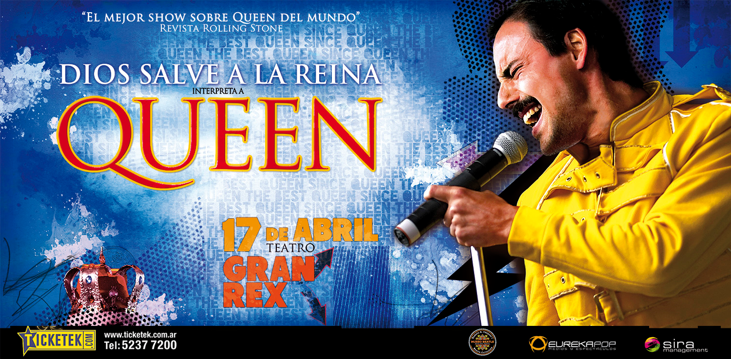
Costume adaptation and visual consistency across different shows. The iconic yellow jacket was reinterpreted to match specific performances
Designed for scale and context
Each campaign was adapted across multiple formats: posters, banners, theatre façades, and large-scale outdoor placements. Layouts were reconfigured to maintain impact across different proportions and viewing distances.
Vertical — street poster
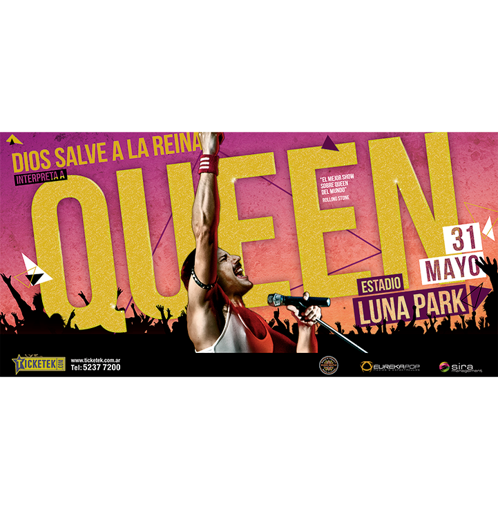
Horizontal — Street poster
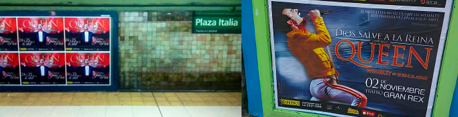
Built for visibility in crowded environments
The work was designed for real-world conditions, competing with urban noise, distance, and scale. High contrast, strong silhouettes, and bold compositions ensured immediate recognition in public spaces. All applications shown are real executions, documented in use across tours and venues.
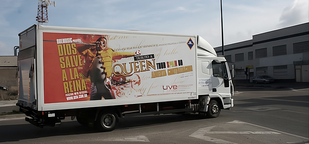
Truck wrap — real execution, Madrid tour.
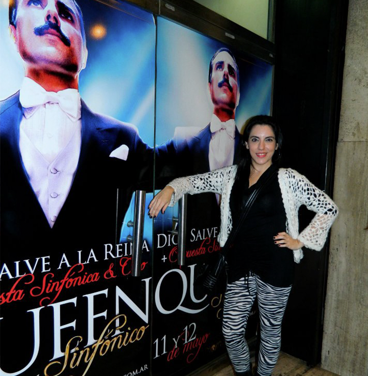
Venue doors — printed and installed for the show.
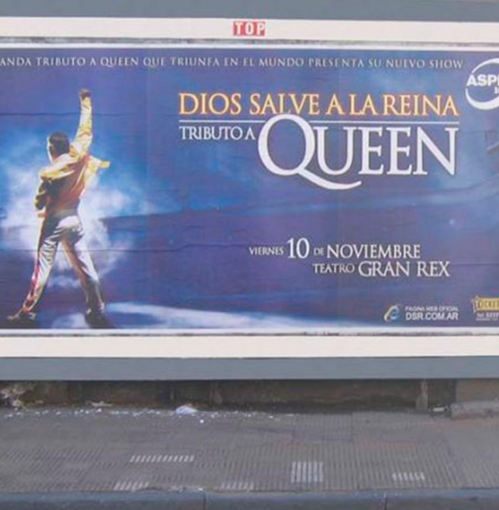
Street placement — real execution, urban environment.
From posters to full show artifacts
The visual direction extended into DVD packaging and printed materials, each reflecting the tone of the show, from archival, documentary-inspired aesthetics to high-energy contemporary compositions.
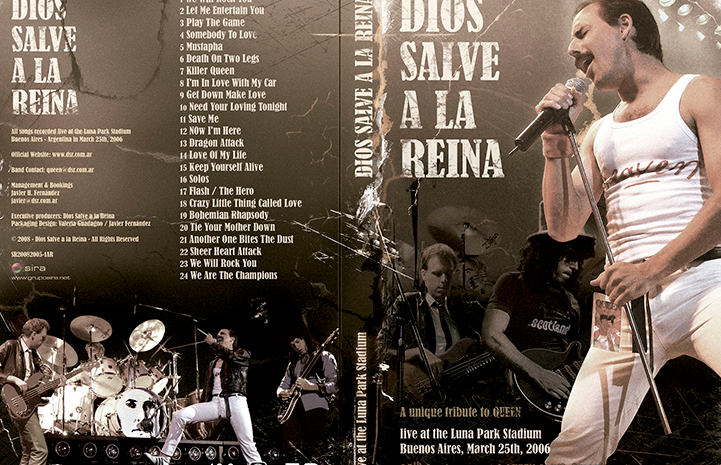
Archival show — aged textures and documentary-inspired aesthetic.
Interior layouts — performance imagery framed as historical record.
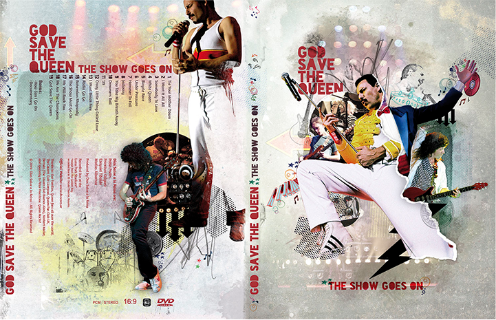
Contemporary show — vibrant collage and high-energy composition.
Interior booklet — dense visual storytelling using photography as texture.
Extending the identity into wearable design
Merchandise translated the visual language into wearable pieces for global audiences. Designs balanced impact, legibility, and production constraints while maintaining consistency with each tour's identity.
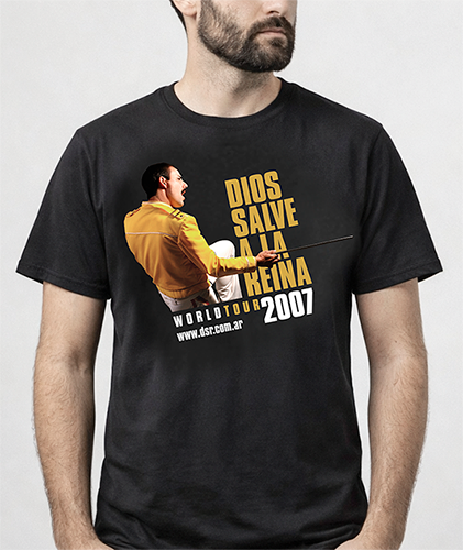
T-shirt — front
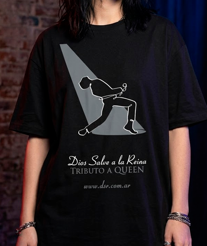
Tour merchandise — vector-based design adapted for single-colour printing without losing visual impact.
Consistent presence across channels
The work extended into digital communication, including website design, responsive email campaigns, and newsletters supporting each tour. These assets maintained consistency with the visual language of each show while adapting to different formats and audiences.
A long-term visual direction across global tours.
Over fifteen years, the project evolved into a long-term visual direction system spanning campaigns, merchandise, digital communications, stage collateral, and environmental graphics. More than isolated pieces, it became a scalable brand language built to perform across markets, media, and moments.