Molinos Agro: Supplier Portal Redesign for Grain & Seed Commercialization
Full redesign of a supplier-facing web portal for Molinos Río de la Plata's grain purchasing operations. Same backend, entirely new interface. Suppliers check contracts, deliveries, and payments in the field, away from a desk, so mobile was not an afterthought — it was a core requirement from day one.
A supplier portal for grain and seed, redesigned to work in the field
Molinos Agro is the supplier-facing portal for Molinos Río de la Plata's grain purchasing operations. The existing system had horizontal tabs, cramped tables, no visual hierarchy, and no mobile support. The brief: redesign it without rebuilding from scratch, same backend, new interface.
One of the structural problems with the old navigation was that the operations team regularly needed to add new modules as business needs evolved. With a horizontal tab bar, each addition pushed items below the main navigation row, creating an inconsistent, growing mess. A fixed vertical sidebar solved this cleanly: new modules slot in without breaking the layout.
Sole designer, embedded with PM, architect and dev team. Domain immersion and heuristic analysis of the existing system before designing anything.
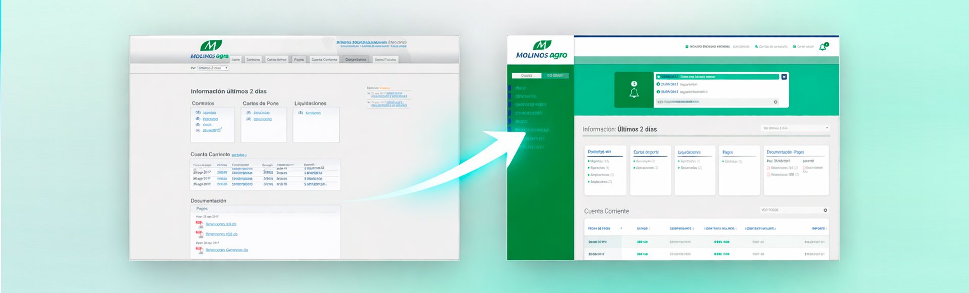
Navigation and layout — the structural shift
Before and after — navigation and layout. The original system used horizontal tabs that broke as new modules were added. The redesign introduced a fixed vertical sidebar, structured section headers, and consistent data tables across all modules. This single architectural decision solved a navigation problem that would have kept compounding.
Information architecture — mapped before any screen was designed
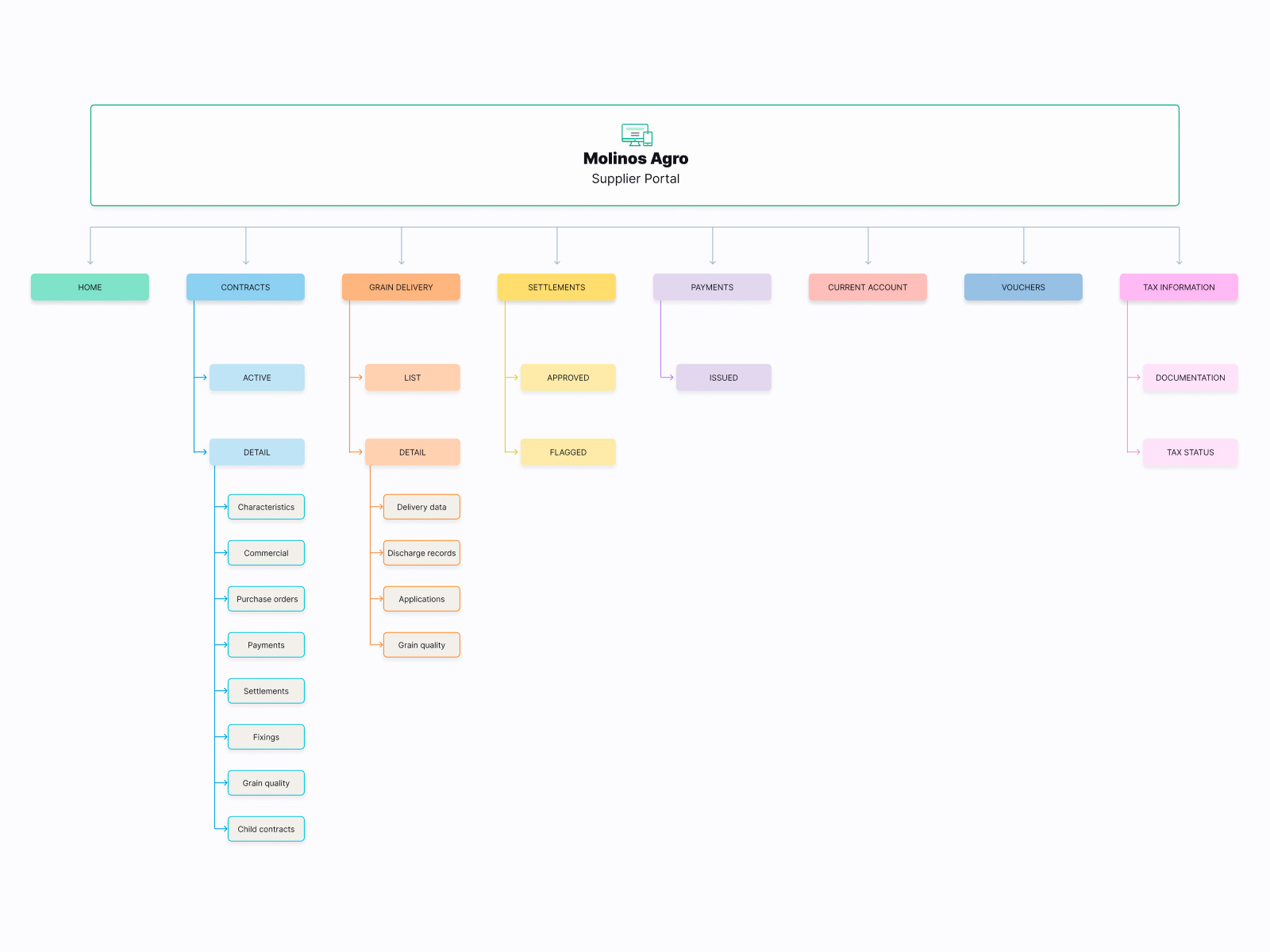
Information architecture - 8 modules, one scalable structure. The vertical sidebar is the backbone: eight modules at launch, each with its own sub-structure. Contract detail is the most complex node, with eight sub-sections that operators need to cross-reference. Mapping this first ensured consistent navigation patterns and interaction logic across the entire system. A ninth module, Freight, was added after launch without touching the navigation structure, validating that the sidebar architecture was the right decision.
Daily activity summary, desktop and mobile
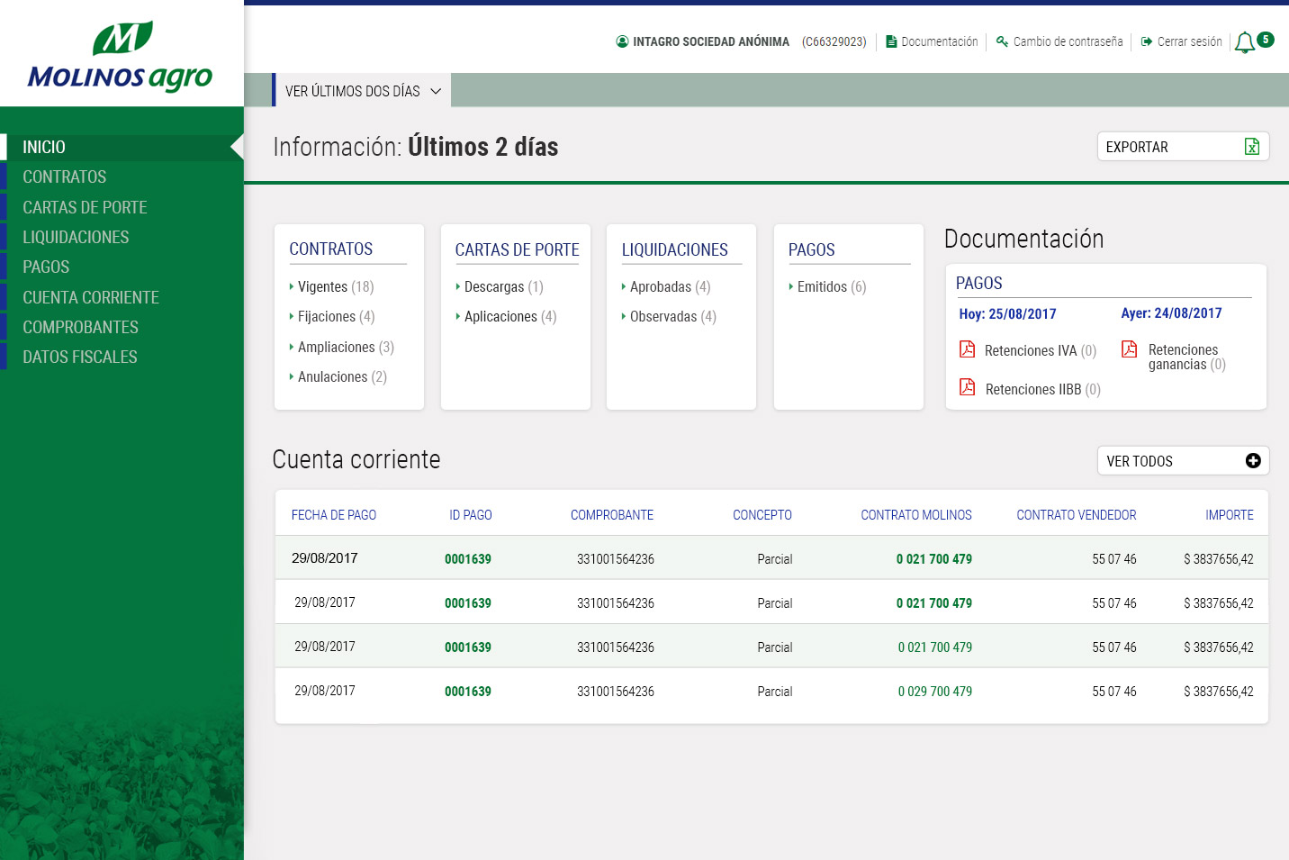
Homepage - daily activity summary. Designed around the supplier's daily workflow: the most time-sensitive data visible without any navigation. Current account balance, recent activity, and module shortcuts are surfaced on the homepage because suppliers typically open the portal to check one specific thing. Summary cards follow a consistent structure repeated across all modules, reducing the learning curve across the system.
Same content — built for the field
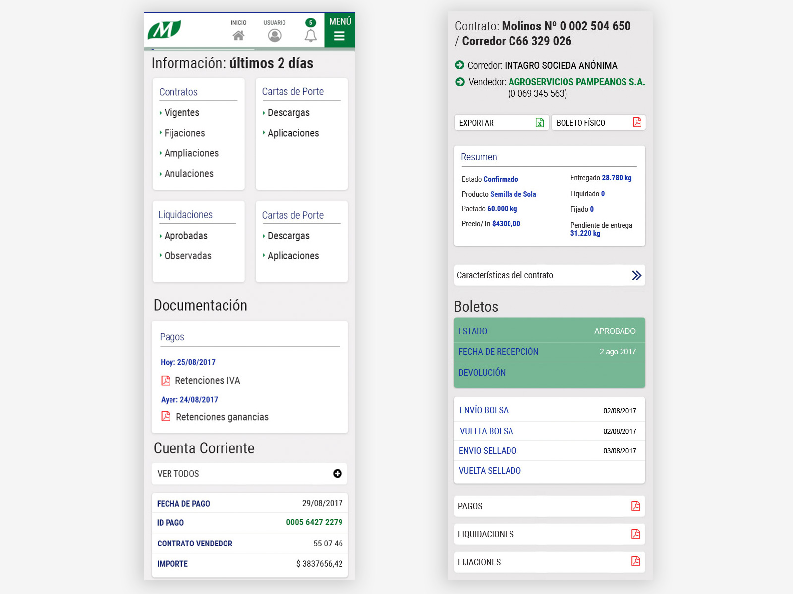
Mobile - same content, built for the field. Suppliers check contracts and delivery data in the field, away from a desk, so mobile was a core requirement from day one. Homepage collapses to stacked cards with hamburger nav. Contract detail uses an accordion pattern: each sub-section collapses independently, keeping the summary visible at the top without forcing full-page navigation between sections.
Progressive disclosure — desktop and mobile
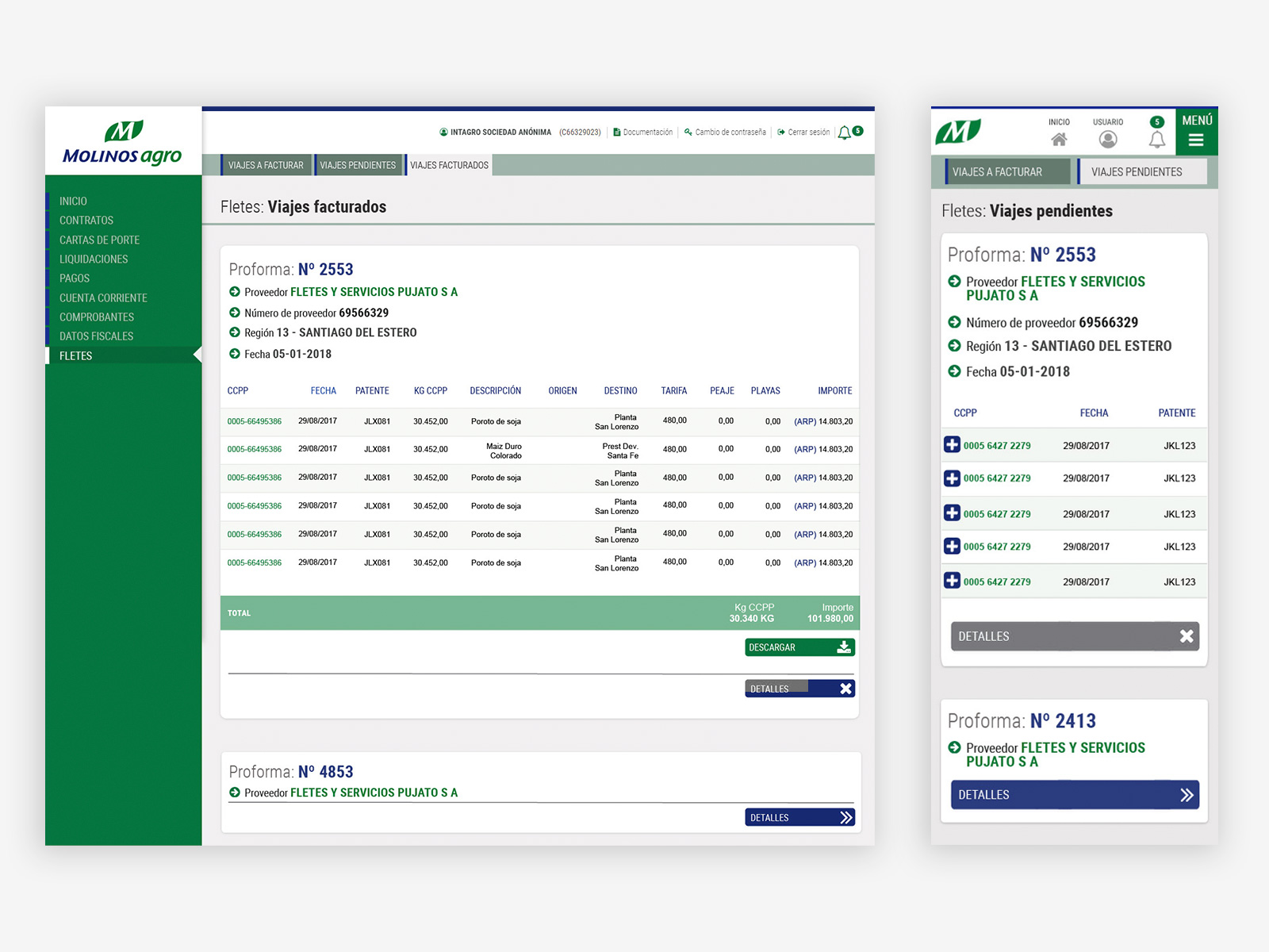
Freight — progressive disclosure on desktop and mobile. Freight proformas collapse by default to reduce cognitive load. Suppliers working between deliveries need to confirm trip status quickly, not read full tables. Expanding only the relevant proforma keeps the screen uncluttered. On mobile, the contrast between expanded and collapsed proformas on the same screen shows the pattern in action. The same progressive disclosure logic is used consistently across all list views in both versions.
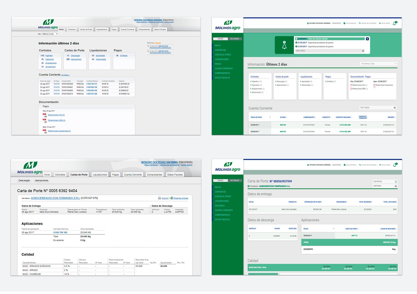
The densest screen made navigable
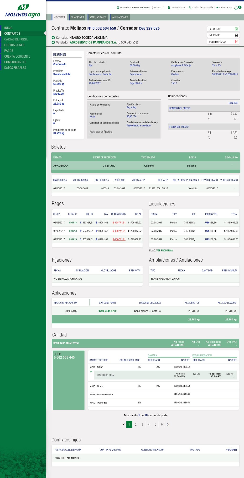
Contract detail — the densest screen made navigable. The contract detail consolidates eight sub-sections in a single scrollable page rather than separate screens, because operators need to cross-reference data across sections constantly. Breaking it into separate pages would multiply navigation friction on an already complex workflow. Two-column layout and color-coded contract links reduce scanning time on dense financial and logistical data.
All data in one view — exportable where it matters
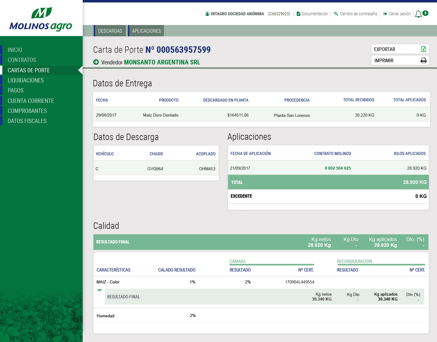
Grain delivery document — all data in one view. Delivery data, discharge records, applications, and grain quality consolidated in one screen because suppliers need all four to resolve disputes without navigating between sections. Export and print anchored at the top because printing is a real workflow requirement for field suppliers.
Ledger and settlements - two patterns for financial data
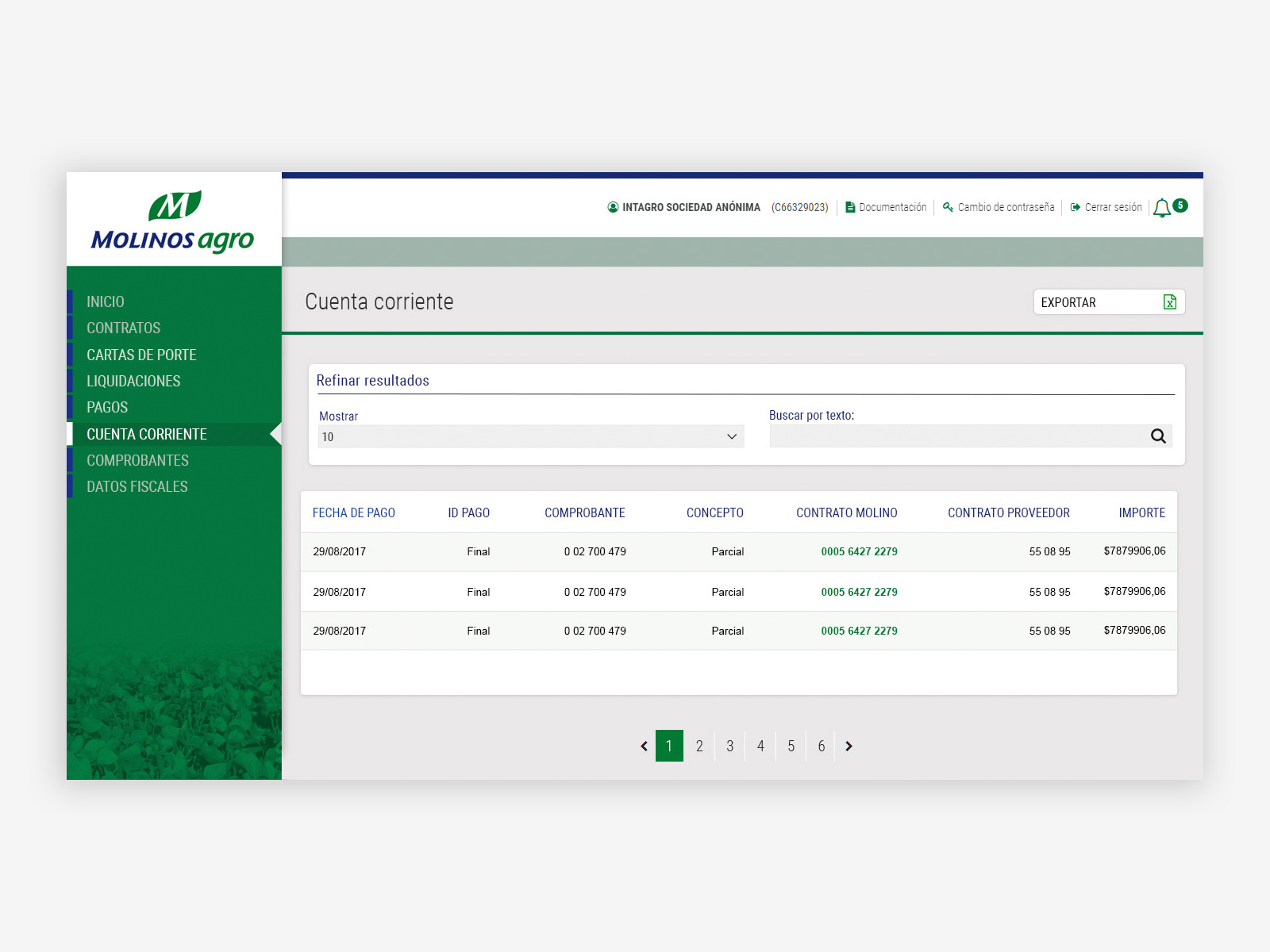
Financial ledger — current balance and transaction history. Current balance is the primary information, anchored at the top in a high-contrast header. Debit, credit, and running balance are shown per row so suppliers can track exactly where a discrepancy occurred. Negative values in red follow standard financial convention for immediate recognition. Date filter and export to spreadsheet cover the two most common operator actions on this screen.
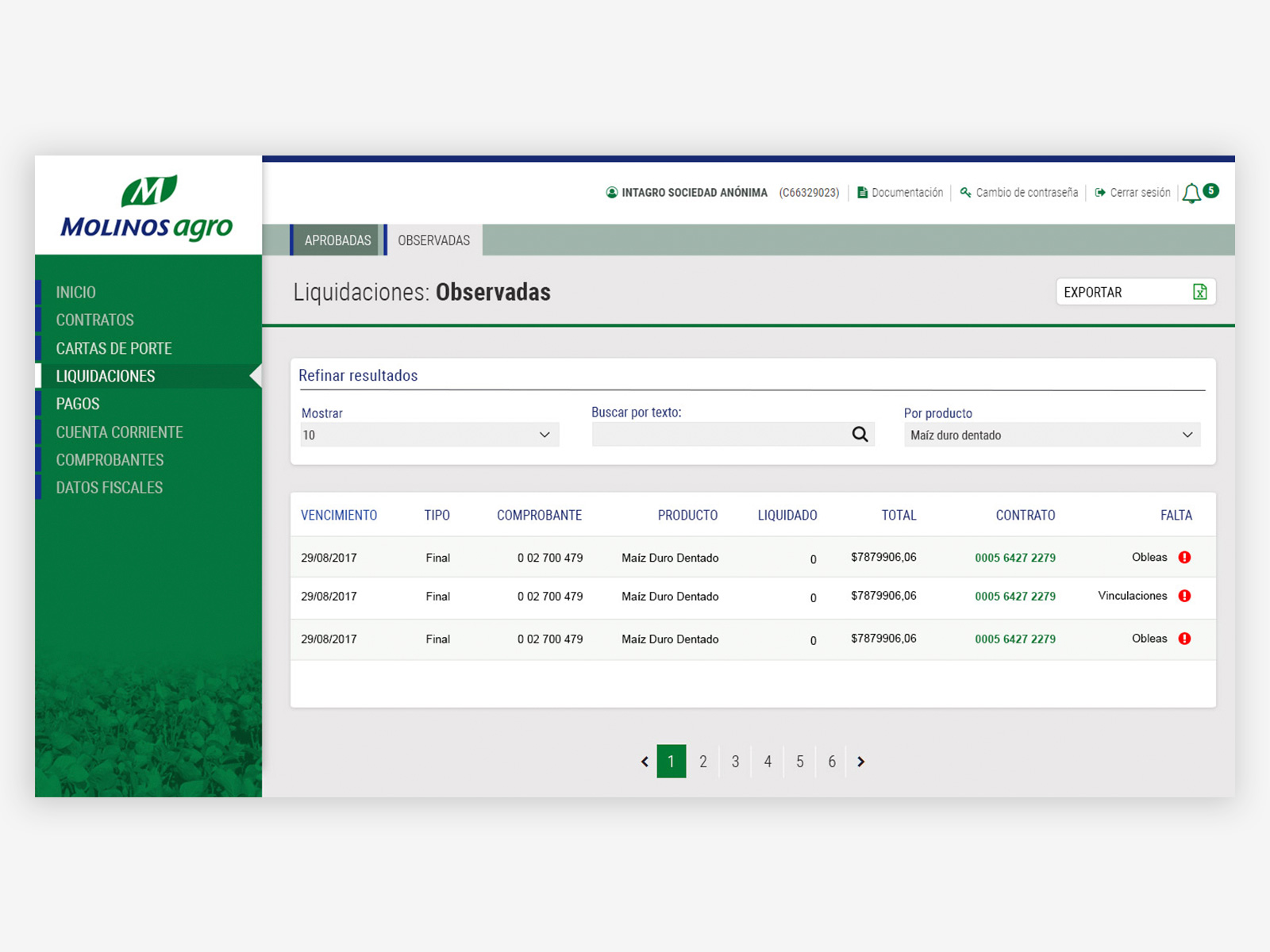
Settlements — status filtering with inline alerts. Tab navigation separates approved and flagged settlements clearly, avoiding mixed lists where actionable items get buried. Error indicators per row surface the specific missing documentation without requiring suppliers to open each record. Multi-column filters let operators narrow by product type or search by text, covering both browse and lookup workflows on the same screen.
9 modules. Fully responsive. Built for the field.
The redesigned portal covered the full supplier workflow — contracts, deliveries, freight, payments, fiscal documentation — responsive across desktop and mobile, with consistent patterns throughout: sidebar navigation, expand/collapse for dense content, and export where suppliers needed it. A ninth module, Freight, was added after launch without any structural changes to the navigation — exactly the scalability the sidebar architecture was designed for. Responsive implementation delivered directly in HTML and CSS, no handoff required.