Remote Computing Portal for Geotechnical Teams
An internal tool for a construction firm, designed to help geotechnical teams request and manage access to high-performance remote computers. Full UX/UI plus visual identity and design system built from scratch.
A self-serve internal tool for high-performance computing access
A construction firm's geotechnical teams needed a reliable way to request and manage access to high-performance remote computers, without going through IT support for every transaction. The portal centralizes machine requests, active machine management, service status, and a learning section into a single internal web app.
The project required designing the full product UX/UI from scratch, as well as creating a visual identity and design system. The team had no existing brand or component library to start from.
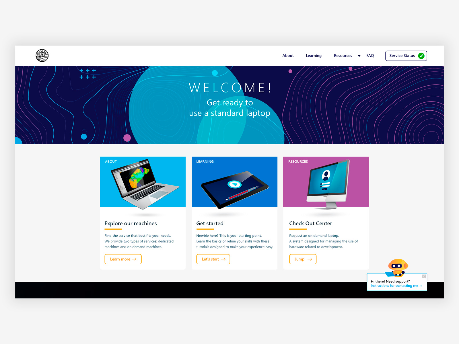
Homepage, three entry points guiding users to the right section based on their immediate need. Service status persistent in the nav so teams always know system availability without navigating away. FAQ chatbot integrated directly in the homepage.
Sole Product Designer, responsible for the end-to-end design of the portal, from information architecture to visual identity. Discovery was based on user interviews and domain immersion in the geotechnical context, working closely with the team to understand how they accessed and managed machines day to day.
- Designing the full portal UX/UI: homepage, About, Learning, Resources, FAQ, Service Status, and the machine request flow
- Creating the visual identity, color system, typography, and iconography built as a small design system to ensure consistency across all sections. The identity was constrained to an acronym by the corporate system, with no custom logo permitted.
- Designing the step-by-step machine checkout flow with location-based filtering, confirmation states, and success/error feedback
- Designing the service status dashboard with real-time uptime metrics, planned outages, and a severity-coded incident log
- Designing machine management actions (check in, reboot, extend, reassign) with appropriate confirmation patterns for irreversible actions
- Integrating a conversational FAQ chatbot to reduce support load, later adopted as a model by other projects within the same organization
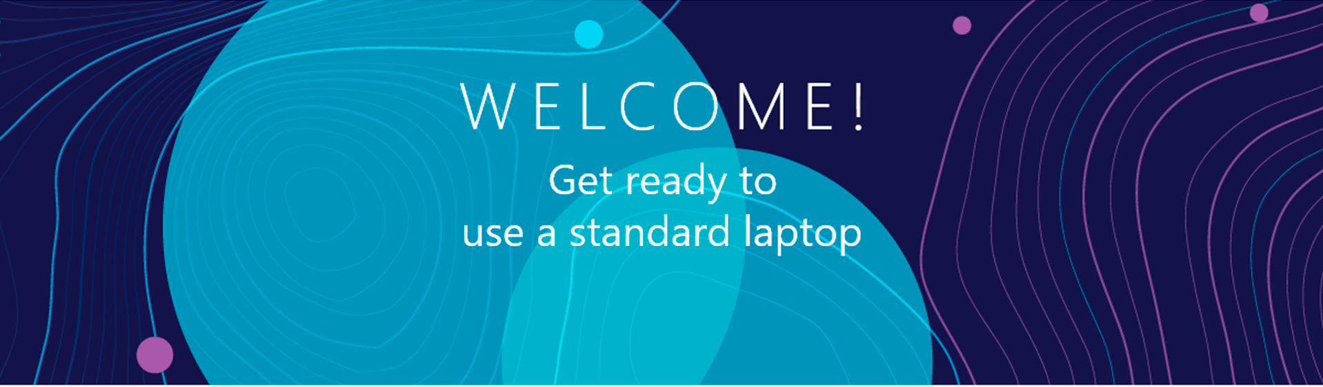
Contour lines from topographic mapping were used as the primary texture and visual motif, connecting the interface to the geotechnical context of the people using it.
The color palette was built to sit at the intersection of both fields, dark blues and cyans that feel technical without losing the warmth of a tool designed for a specific community.
Corporate constraints limited the identity to an acronym with no custom logo. The design system compensated with consistent typography, iconography, and the topographic graphic language to create a coherent product identity.
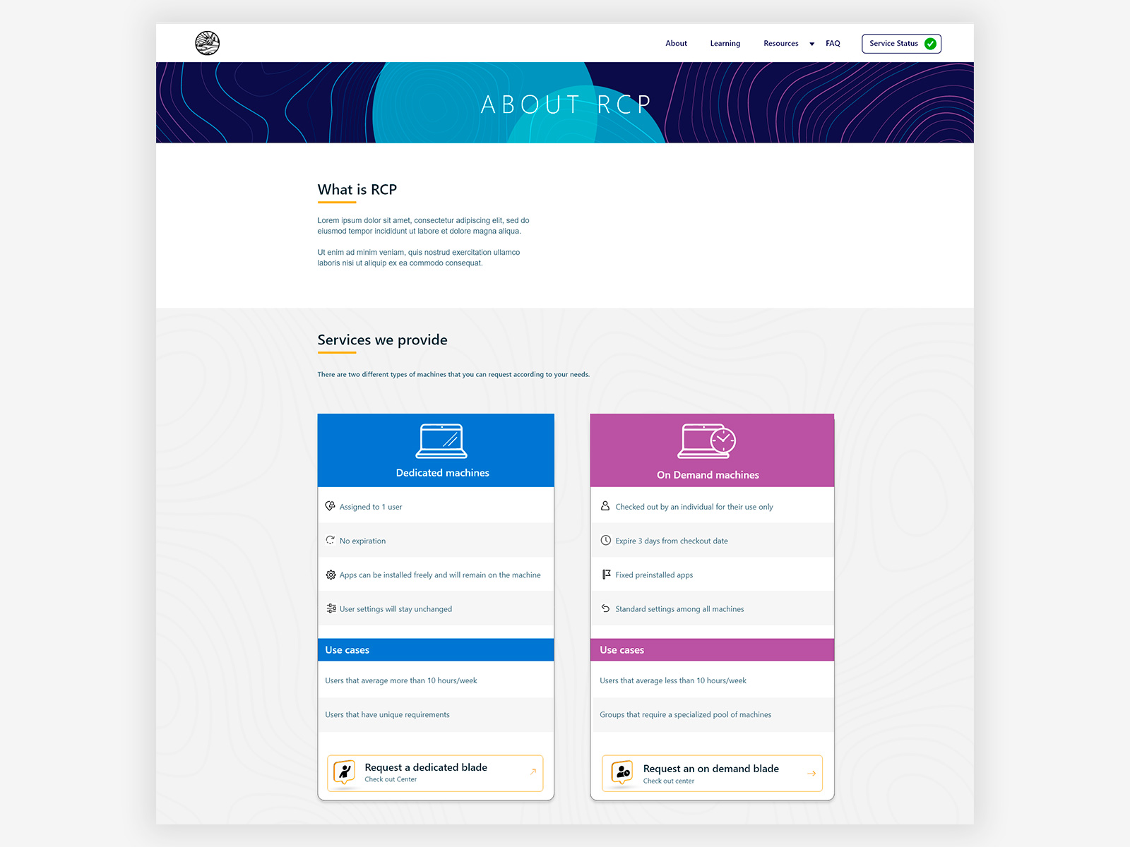
About page, side-by-side comparison of dedicated and on-demand machines with use cases and direct request actions, helping users self-select the right service without contacting support.
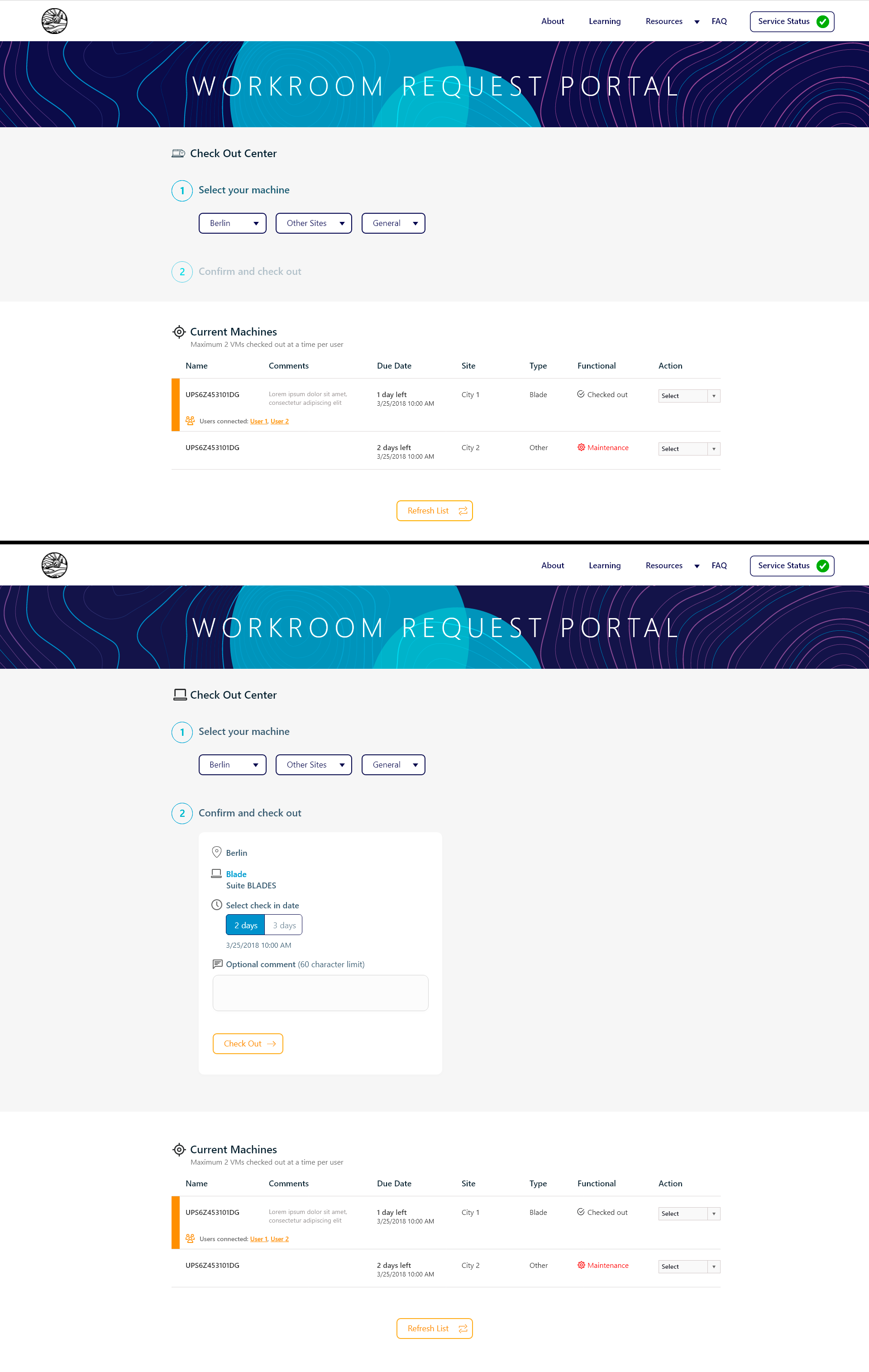
Machine checkout flow, a two-step process with cascading location filters and a confirmation card before committing. The original design included a long numeric dropdown for request duration that didn't reflect actual system constraints. After identifying that the system only supported 2 or 3 days, the dropdown was replaced with a simple binary choice, eliminating the need for a follow-up email correcting invalid selections.
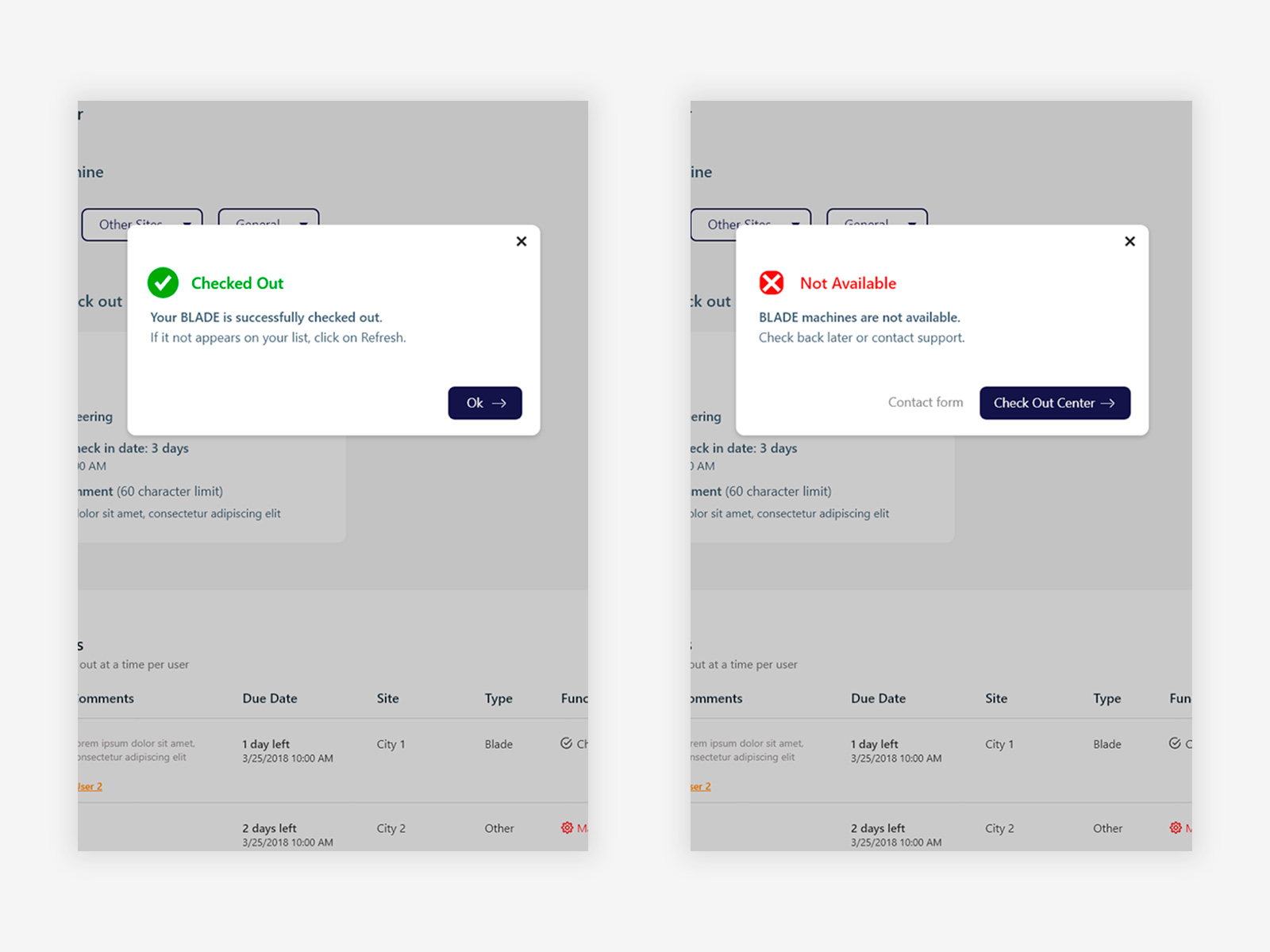
Success and error states with clear outcomes and actionable next steps, avoiding dead ends in a workflow where availability depends on shared inventory.
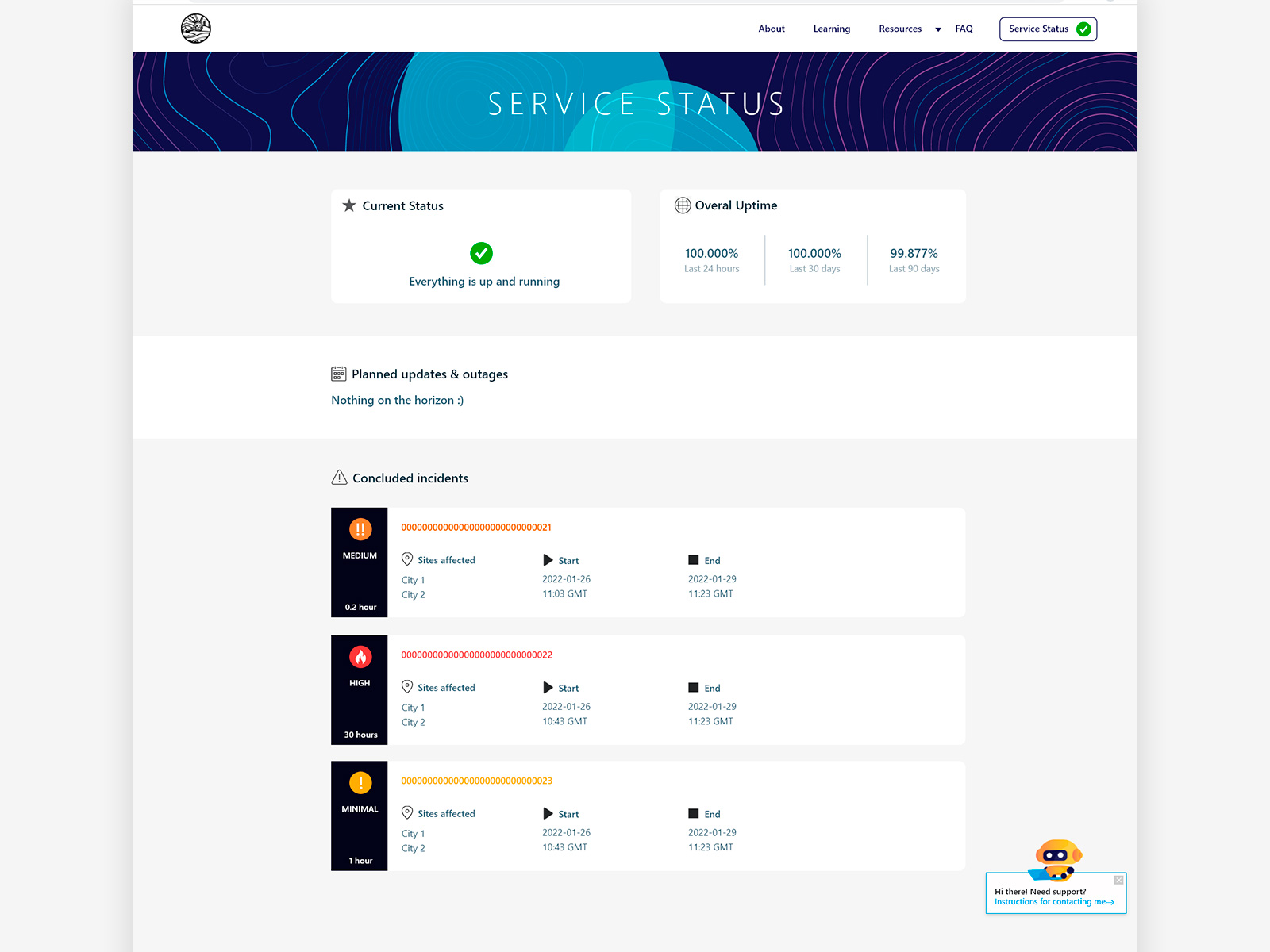
Service status dashboard, current status, uptime metrics across three time windows, planned outages, and a severity-coded incident log (Minimal, Medium, High) with duration. Designed so teams can assess system availability at a glance without contacting support.
Choices that shaped the product
With no existing brand to reference, the identity was built from the context of the people using it. Contour lines from topographic mapping became the graphic language, giving the portal a visual connection to geotechnical work while still feeling like an IT tool. The result is an identity that belongs to this specific team rather than a generic enterprise portal.
The About page presents a direct comparison of dedicated and on-demand machines with use cases and request actions inline. Users can understand the difference and act immediately without navigating to a separate page or contacting support, reducing friction for a technical audience that prefers to make their own decisions.
The original design included a long numeric dropdown for how many days to request a machine. After identifying that the system only supported 2 or 3 days, the dropdown was replaced with a simple toggle between those two options. This eliminated a class of errors where users selected unsupported durations and then received a correction email after submission.
System availability is the first thing a user needs to know before requesting a machine. A persistent status indicator in the nav gives teams immediate visibility without requiring a separate navigation step. The status dashboard itself covers current state, uptime history, planned outages, and concluded incidents with severity levels.
A conversational chatbot was integrated in the homepage to handle frequent questions without routing users to IT support. The pattern worked well enough that it was subsequently adopted as a model by other projects within the same organization.
A complete product, from brand to interaction.
The portal covered the full lifecycle of machine access (request, manage, monitor, and learn) in a single coherent web experience. Designing the visual identity alongside the UX meant every decision was made in context, producing a product that felt intentional rather than assembled. Delivered to strong positive reception from the PM and the geotechnical team, with the FAQ chatbot pattern adopted as a model by other projects within the organization.